Results LIMS Challenge 9
Great turnout for Lims Challenge 9! Unfortunately 1 participant will be leaving us tonight.
ELIMINATIONS
VOTED OFF
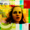
by lastyearswishes (-5)
CONGRATULATIONS!
FAVORITE ICON + BANNER
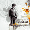
by 17tvfreek (+2) » Click to Save your Banner !
NO NEGATIVE VOTE (Congrats!)

by 17tvfreek (2)
MOVING ON TO NEXT ROUND
17tvfreek
beybey16510
narniacmr
rhye
VOTING TALLIES!
Here's the tally. Remember we're picking 3 least favorites and 1 favorite. Therefore, a negative (-) denotes how many people voted against your icon and a plus (+) denotes how many people voted your icon their favorit, zero (0) means you got neither or that they anuled each other out. So if you have a + point, pat yourself on the back!
Lims Challenge 9: Complex Icon
01
02
03
04


05
-
-
-

-
-
-
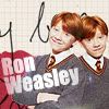
01: -1 + 0 = -1
02: -0 + 2 = 2
03: -5 + 0 = -5
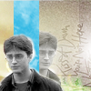
04: -2 + 1 = -1
05: -2 + 2 = 0
+ POSITIVE VOTING COMMENTS +
#02 -- The composition fits the concept of a complex icon without being too busy and I really like how the grey-tones with a single splash of colour gives the icon a crisp, fresh feel.
#02 -- Nice composition for a complex icon, it look very pretty and creative. Well done.
#04 -- The textures are really well done and the colors really add to the emotion of the icon.
#05 -- The light texture perfectly highlights the blending of Harry and Ginny. The text is clear and easy to read. The background texture compliments the foreground subjects.
#05 -- The colors are great and its a well constructed icon that fits the challenge.
- NEGATIVE VOTING COMMENTS -
» Don't take these comments as mean pointless critics, they could help you make a better icon for the next challenge!
#01 -- The different elements of this icon don't relate well to each other. The red clashes with the colors of Ron. The black text draws attention away from the white text, but it's not legible.
#03 -- Hermione's face is too dark and muddy, which makes it clash with the bright, crisp colours of the background.
#03 -- The way the colors come together on Hermione's face is unflattering. Her chin is very orange and her forehead is very yellow.
#03 -- I think there are too many colors in the icon that makes it look a bit messy. Also perhaps if the composition was less centered it would look better.
#03 -- The background looks nice bu the yellow coloring is too dark on Hermione.
#03 -- The coloring on Hermions is too dark and overpowering. A more lighter image would have looked better with the pale background.
#04 -- The overall icon could do with a bit more contrast. For example if the blacks were a bit darker on Harry and the colors a bit brighter in the background.
#04 -- The icon seem a bit flat, it would look better with more contrast.
#05 -- It doesn't really fit the challenge as well as the others, it does not look really complex. The concept is good, just not particularly for this theme and Harry's face is too dark in comparison to Ginny's.
#05 -- While I like the composition, the text is difficult to read and Harry looks over sharpened.
It's farfadine's turn to do the Nomination for the winning icon. (with the Noms for Week 246 in a couple of days)
ELIMINATIONS
VOTED OFF
by lastyearswishes (-5)
CONGRATULATIONS!
FAVORITE ICON + BANNER
by 17tvfreek (+2) » Click to Save your Banner !
NO NEGATIVE VOTE (Congrats!)
by 17tvfreek (2)
MOVING ON TO NEXT ROUND
17tvfreek
beybey16510
narniacmr
rhye
VOTING TALLIES!
Here's the tally. Remember we're picking 3 least favorites and 1 favorite. Therefore, a negative (-) denotes how many people voted against your icon and a plus (+) denotes how many people voted your icon their favorit, zero (0) means you got neither or that they anuled each other out. So if you have a + point, pat yourself on the back!
Lims Challenge 9: Complex Icon
01
02
03
04
05
-
-
-
-
-
-
01: -1 + 0 = -1
02: -0 + 2 = 2
03: -5 + 0 = -5
04: -2 + 1 = -1
05: -2 + 2 = 0
+ POSITIVE VOTING COMMENTS +
#02 -- The composition fits the concept of a complex icon without being too busy and I really like how the grey-tones with a single splash of colour gives the icon a crisp, fresh feel.
#02 -- Nice composition for a complex icon, it look very pretty and creative. Well done.
#04 -- The textures are really well done and the colors really add to the emotion of the icon.
#05 -- The light texture perfectly highlights the blending of Harry and Ginny. The text is clear and easy to read. The background texture compliments the foreground subjects.
#05 -- The colors are great and its a well constructed icon that fits the challenge.
- NEGATIVE VOTING COMMENTS -
» Don't take these comments as mean pointless critics, they could help you make a better icon for the next challenge!
#01 -- The different elements of this icon don't relate well to each other. The red clashes with the colors of Ron. The black text draws attention away from the white text, but it's not legible.
#03 -- Hermione's face is too dark and muddy, which makes it clash with the bright, crisp colours of the background.
#03 -- The way the colors come together on Hermione's face is unflattering. Her chin is very orange and her forehead is very yellow.
#03 -- I think there are too many colors in the icon that makes it look a bit messy. Also perhaps if the composition was less centered it would look better.
#03 -- The background looks nice bu the yellow coloring is too dark on Hermione.
#03 -- The coloring on Hermions is too dark and overpowering. A more lighter image would have looked better with the pale background.
#04 -- The overall icon could do with a bit more contrast. For example if the blacks were a bit darker on Harry and the colors a bit brighter in the background.
#04 -- The icon seem a bit flat, it would look better with more contrast.
#05 -- It doesn't really fit the challenge as well as the others, it does not look really complex. The concept is good, just not particularly for this theme and Harry's face is too dark in comparison to Ginny's.
#05 -- While I like the composition, the text is difficult to read and Harry looks over sharpened.
It's farfadine's turn to do the Nomination for the winning icon. (with the Noms for Week 246 in a couple of days)