Resourceful: #02

Welcome to Resourceful #02, a second helping of wonderous activities based on creating resources (as a challenge or individually) for our amazing members as a way of saying thanks!
The second challenge accepted by makers was a graphics related Questionnaire. Those who wished to participate simply filled in the following twenty questions. So kick back and share an evening (or morning or afternoon) with some wonderous_stuff makers.
1. When & why did you start making graphics?
tinebrella: There's a when, but I don't think I can provide a why. I started making icons around summer 2008. I used to read/write fanfictions back then, and a fanwriter friend of mine popped up with "Do you know how to make icons?" during a msn conversation. I didn't, but surprisingly I had PS CS2 installed on my desktop, so... I just started making icons. Out of nowhere. My very frst icon was probably one of L, from Death Note. Or Heine, from Dogs: Bullets & Carnage.
firstillusion: Two things happened at once: 1) I was on a Lord of the Rings forum and I wanted to make my own avatars. 2) My art teacher started talking about this thing called 'Photoshop' and was kind enough to let me stay after school to figure this programme out, because I had to do a graduation art project, but couldn't draw for shit. I got an A+ that year. *proud*
raiindust: Around 2005/2006, because I was on Degrassi discussion boards and everyone had these amazing sig tags and I just wanted to explore the magical world that it seemed to be. That led somehow into icons - perhaps when I discovered Live Journal and its intricacies around the beginning of 2006, and I guess I've never looked back. It's such an amazing way for someone who isn't artistically inclined (I perfected the flower and the butterfly thanks to procrastination during Uni but cannot draw beyond that) and someone who enjoys technology to just relax.
deternot: I started making icons in 2008! I know I had made a few for rp purposes but I mainly got into it as a way into fandom since I didn’t want to write fic.
rocketgirl2: Oh geez. I think 2007 or 2008 was the year I made my first icon, and that was because I had an idea for a terrific icon and nobody had made it. A year or so later, I came back to it because I was bored over my summer break and I enjoy creative things like iconning.
2. A color/s you love to use on your graphics.
tinebrella: Blue, red and purple.
firstillusion: Blue!
raiindust: Yellow. It's a blessing and a curse, but yellow seems to just appear whenever I begin to make icons. Recently I've also had a tendency to use some green as well.
deternot: ALL THE COLORS I really like yellow. And purpley-blues.
rocketgirl2: MAGENTA. This isn't super apparent in my posts because I always stop myself from making everything magenta, but there is a stage of every icon where I see how It would look with magenta just because I can.
3. A color/s you find impossible to use on your graphics.
tinebrella: Green and yellow.
firstillusion: Purple.
raiindust: Red. I don't know why, but it never appeals to me. I will even turn red-ish colouring into pink to get away from it.
deternot: Red. Ugh.
rocketgirl2: …black and white. I know that isn't really a color, technically, but I have so much trouble making icons that don't have color. :(
4. Top 3 Textures
tinebrella: I'm totally abusing this set by deny1984:

And especially this texture:

firstillusion:
1.

(I still don't know who made this, please help me!)
2.

(by neversince)
3.

(by windsonnetss)
raiindust: Texture 1, Texture 2, Texture 3 all by elli.
deternot: I’ve been trying to experiment a bit more with textures and here are 3 of my recent faves to overuse!


midnight_road lookslikerain drankmywar
rocketgirl2:
I can only pick three? Very well, these:


5. Top 3 Texture sources/makers.
tinebrella: This is very difficult. But I'd say deny1984, innocent_lexys and perhaps blueymcphluey for the large, painted textures.
firstillusion: In alphabetical order: fuuurs, lessrest, lookslikerain
raiindust: elli, mm3butterfly & fuuurs.
deternot: tinebrella, innocent_lexys, midnightroad
rocketgirl2: I use SO MANY textures that it is hard to say, but lately I've been rocking a lot of bourbonate, innocent_lexys, and midnight_road's work.
6. A texture you really like but never quite know how to use it.
tinebrella:
This one by deny1984:
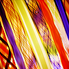
I find it quite impossible to use, and yet so beautiful.
firstillusion:

(by pandavirus).
Technically, I know how I would like to use it. I just haven't found the perfect picture yet.
raiindust: Most tumblr-like textures are a challege for me, because I never quite know how to fit them into an icon.
deternot:

by innocent_lexys
rocketgirl2:

7. Top 3 Fonts
tinebrella: Right now: PTF Nordic, Georgia, Nouvelle Vague.
firstillusion:

raiindust: Radiohead, Reboard & Vinyl Stickons
deternot: Arial Black, Cleanvertising, Futura I’m a Font-Failure
rocketgirl2: Haha text um. A lot of fonts I love don't work super well on icons (at least, for me), but Amanda's Script, CP Mono, and League Gothic have all found their way into my icons in the past.
8. Top 3 Brushes
tinebrella: Default round brush, default 'Big Coal Blot' (or something like that), this one by inxsomniax.
firstillusion: Basically the only brushes I use are from the Insomniac set by Hybrid Genesis.
raiindust: Round point stiff, flat angle low bristle count & flat blunt short stiff. I've been using these in regards to texture making and they are all pretty fun to play around with!
deternot: Soft Round, Calligraphy Oval and Waxy Crayon (They all came in my PSE under those names... I’m a Brush Failure too!)
rocketgirl2: PS' soft round brush (variable sizes) and #5 in this set are the only two I use in my icons with any regularity. I've also been playing around with these lately, and they seem nice.
9. Top 3 Filters
tinebrella: Paint Daubs, Gaussian Blur, Reduce Noise. All of them for sharpening/blurring purposes.
firstillusion: High Pass, Gaussian Blur, Smart Sharpen (I'm conventional, I know).
raiindust: Box Blur, Paint Daubs & Cross Hatch.
deternot: Guassian Blur, Unsharp Mask... Motion Blur?
rocketgirl2: Paint daubs and high pass (both for sharpening); box blur (for blurring) #boring
10. Favorite tool in Photoshop
tinebrella: At this moment, Variations.
firstillusion: Levels, Layer Mask, Variations.
raiindust: Currently it's a tie beteween colour balance & vibrance + hue/saturation. Both have been used and abused recently, which has been an enjoyable experience.
deternot: The Undo Button hawhaw... No um, I’ve gotten really into Radial Gradients?
rocketgirl2: …are adjustment layers a tool? Because I use them more than anything else. Other than that, layer masks.
11. Are there any techniques you find yourself using over and over again with graphics?
tinebrella: No, I don't think so. I always experiment and my approach to icons changes from time to time and depending on the fandom I'm working with. I mostly go for medium center crops, perhaps. And I'm quite obsessed with painted textures at the present moment. But nothing is carved in stone. Maybe I'll go back to minimalistic and clean tomorrow, who knows? :D
firstillusion: The soft light 'blobs' to lighten up images.
raiindust: I definitely have a tendency to over-use textures that I become fond of - especially when I'm working on batches of icons at a time rather than individual icons. Somehow they all become collected into one place and they are used on just about every other icon I make. I also defintitely get into grooves with some of the layers, which is a pain to get out of but also fun to try and move between without getting stuck down to one particular "thing".
deternot: Brushing on colors, soft light and screen layers
rocketgirl2: SEE ABOVE. Also copy + merge → soft light layers (sometimes blurred or sharpened), masking/painting/texturing over backgrounds, texture abuse in general??
12. Icons, makers or icon makers who inspire me:
tinebrella: Too many to list them.
firstillusion: I'm not making a list, because with every list, someone will feel left out and I'm bound to forget someone. Also: I tend to fall for certain icons rather than makers. (I have the same with music.) I basically respect the hell out of everyone who can blend well and everyone who uses textures creatively.
But, to share a small secret: I will forever love the grainier backgrounds from a few years back:


_omnivore_, chouchoune, rainyrainydays, boxed
raiindust: Currently I have huge admiration for everybody__lies, lemonzter, spg_spn_girls & hauntes, because they all explore kind of awesomely incredibly extremes of iconing. But in all honesty, so many icon makers inspire me.
deternot: I find almost every icon to be inspiring in some way, as cheesy as that sounds, but disregarding other w-s makers, makers like mm3butterfly, likealight and imaginary_lives are really big inspirations of mine!
rocketgirl2: So many I can't list them al! But near the top are the wonderous makers here!
BONUS QUESTION Share your inspiration folder if it pleases you.
tinebrella: Not going to share my inspiration folder because it's like 200+ MB, but I post monthly inspiration folders at my graphics journal ( tag).
firstillusion: Here you go!
raiindust: Inspiration Folder
deternot: Nooooo it is a huge mess!
rocketgirl2: here.
13. Base PSD: Share with everyone the beginnings of an icon, or the beginnings of how you begin all your icons.
tinebrella: No need to share a psd: I usually create a Curves layer and click on Auto. (and hope for the best)
firstillusion: Like this, basically, only on a larger canvas to extend the background properly.
raiindust: Sharing is caring
deternot: http://www.sendspace.com/file/gsbj0q
rocketgirl2: Adjustment layers, ahoy!
14. Top 3 Tutorials (made by others)
tinebrella: There are many good tutorials out there, but my favourite is this cropping guide by kellslawells.
firstillusion: 1. This one by absolutelybatty taught me so much about light, colours and extending backgrounds.
2. The most sensible basic icon making guide out there, in my opinion, by talipuu.
3. Everything you need to know to understand curves by talipuu.
raiindust: A Guide to Color Normalization by kibethsbark. I'm amazed every time I open this because kibethsbark manages to make Firefly caps look amazing which is a miracle.
A Coloring Guide by hauntes. Something new, but I'm a huge fan of the way hauntes plays with colorus, so this was incredibly insightful and really quirky and fun.
Tutorial Index by fan_cifully. A cheat? Maybe - but this tutorial index is beautifully organised and full of wonderful links for any icon maker!
deternot: Guide to Cropping but imaginary_lives
Blending for Dummies by tinebrella
Brown Coloring by twinstrike
rocketgirl2: Oh man. I've read so many, but I am terrible at keeping them organized. I do remember liking this blending tutorial from word_never_said, text guide by 12feethigh, light blobs by neversleeps.
15. Top 3 screencap sources
tinebrella: cinemasquid, disparue, grande-caps.
firstillusion:
1. Used to be rawr-caps, so there's now grande-caps;
2. enchantedfleur, and
3. homeofthenutty
raiindust: grande_caps, homeofthenutty, Leave Me the White.
deternot:
Grande-Caps, Leave Me the White and Home of the Nutty.
rocketgirl2: grande_caps, homeofthenutty, fishsticktheatre
16. Things you want to learn to do.
tinebrella: Blocking, really complex compositions.
firstillusion: Blending. Perfect sharpening on Game of Thrones icons.
raiindust: I think I'd like to explore a couple of styles that I'm really enjoying lately, especially those mentioned above. Either pale, soft, but very interesting colourings , or bolder colours and creative compositions.
deternot: Complex icons, text work, painted/grunge-y icons
rocketgirl2: BE BETTER AT ICONS of course. I want to experiment a bit with texture use so I can use modes other than screen or soft light and make icons that aren't unusable.
17. Something you want to improve on.
tinebrella: Blending, text use.
firstillusion: Blending. Creative compositions. Text. Close crops. Pale colours.
raiindust: Multiple image composition and close cropping, neither are my strengths so I avoid them which in turn makes them generally not as remarkable when I do attempt them.
deternot: Everything! But especially manga coloring.
rocketgirl2: I am terrible at composition, so I want to improve in that area. And text! One can never be good enough with text.
18. Share 5-10 icons that you believe reflect your overall style.
tinebrella: I don't know if I have a style, but if so, I'd say simple compositions, monochromatic coloring, sharp contrast, medium center crops and possibly quite obvious texture use.
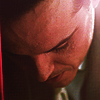
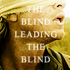
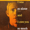
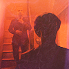
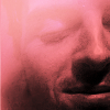
firstillusion:


raiindust:


deternot:


rocketgirl2:


19. Share 5-10 icons that you believe reflect where your icons are going.
tinebrella: I can't tell where my icons are going, but I can say which direction I want them to take. That is, more complex composition, more daring crops and/or coloring, and more text involved.
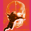
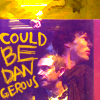
firstillusion:


raiindust: I'll be honest and tell you I have no idea how to answer this question. My icons moved from one thing to another then back again, but the journey is still hapenning - but when I know, you'll probably know too ;)
deternot: Who knows, really? But I’ll try:


rocketgirl2:


20. Finish this sentence: "The key to a good graphic is..."
tinebrella: "The key to a good graphic is recklessness."
firstillusion: "The key to a good graphic is balance."
raiindust: "The key to a good graphic is imagination."
deternot: "The key to a good graphic is the right mood." If I try to make icons and it doesn’t feel like fun, what’s the point? I’ll end up hating them and not having fun. If I’m in a good mood when I’m making icons, then they turn out better and even if they don’t, I learn more from what went wrong and maker a better graphic next time.
rocketgirl2: "The key to a good graphic is balancing technique and creativity."
42 icon sized textures by tinebrella

Download pack here
30 Textures by longerthanwedo

Download pack here
30 icon sized textures + 3 larger textures by raiindust

Download pack here
You have brains in your head so...
1. Please credit the correct maker. You can find their wonderous identities attached to their individual resources.
2. Please do not edit any of the resources you find in this post.
3. Comment if we've delighted your eyes, inspired your minds, or even if you think we could have done better. We'd love to hear from you (because no one is youer than Y-O-U).