'The Balance of Red & Blue': Color Symbolism in context of Fate & Free Will in Season Five
So, apparently I’ve been out of school for too long and had the urge to write a paper? Who knows…
This thing got ridiculously massive very quickly, I blame it all on Serge Ladouceur for making me all thinky. I want my brain back, Serge!
I recognize whenever we start talking about colors we pass into nebulous territory, so you can take this all with the grain of salt it is. But the usage of colors red and blue by production design and cinematography in Supernatural have had me curious for years. And this season, with an increased prominence of these two colors together consciously placed within the same shot, finally made me organize my thoughts in one place. Includes picspam evidence from the first eight episodes, some background on the colors of red and blue, and my own interpretation of its meaning.
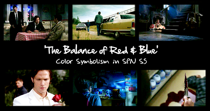

'The Balance of Red & Blue': Color Symbolism in context of Fate & Free Will in SPN S5 (so far!)
The colors of red and blue are no strangers to this show, they've shown up frequently in past seasons as bowtrunckle, hearseeno, & sadelyrate have shown in their color symbolism posts in the past. But the balance employed between the two has become especially striking this season, and I just haven't been able to get them out of my head.
To my knowledge, prior to this season, on an episode-by-episode/scene-by-scene basis, these colors have been used sparingly. The majority of the show's palette has always been confined to more neutral, washed-out colors and dark backgrounds. But each season has had a predominantly associated color. Season 1's major color palette was of blue and green hues. Season 2's major color palette faded to even less color, though trending toward less blue, and more green. Season 3's major color palette is largely regarded as predominately yellow. And Season 4's had the most red, warmth hues we've seen yet, primarily seen in dealing with Sam, Ruby, and Dean's Hell experiences. But on the flip, we also had some blue hues reappear with the angels introduction, predominately used to characterized Castiel (right down to his blue tie).
Yet this year, there seems to be a real strong red and blue theme. Not just appearing in separate instances like last season, but together. That is, both colors existing in the same shot in a way that seems to signal an intentional attempt to balance both colors.
dotfic has showcased some of the red and blue used in 5.04, 5.06, and 5.07 so far this season. And I touched on it briefly in my meta picspam on 5.04's lighting HERE. But what was the main purpose of these colors? I’ll admit it's been driving me kinda crazy. Why all the increased occurrence of red and blue this season, to the point where it feels like the show doesn't even care about any other color these days?
I had almost convinced myself that the lighting and set people must be doing different things, because the color usages were giving me mixed signals from objects to backlighting to foreground lighting. But that didn‘t seem right, they should all be working in concert. It is after all the DP’s job to coordinate everyone. And it couldn’t be some random out of the blue point either, because they should be subservient to the text just as scoring should be. So it must serve the overall season‘s theme, right?
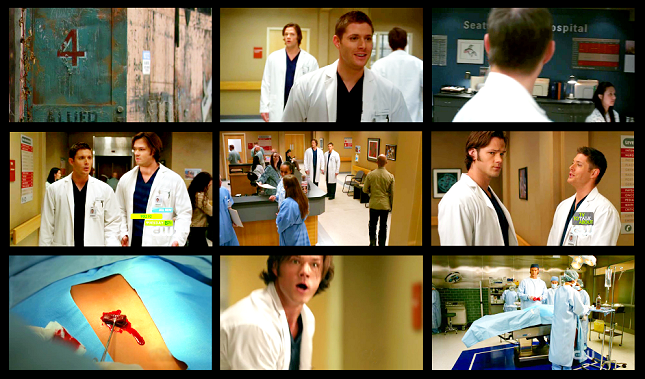
Then I saw ‘Changing Channels’, and look at all of this red and blue!! If anything was a CONSCIOUS choice, it was this. Here we have saturated film and yet still have these two colors everywhere. Red and blue included intentionally in almost every shot!
Obviously I can’t cap it all, but I’m not exaggerating when I say almost every shot in the hospital had a red sign to complement the boys' blue scrubs and white doctor coats.
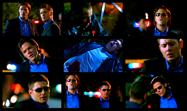
Then the CSI spoof was also ALL red and blue. Everyone was wearing blue, while the red blood and heart staking were accented. And we had that red lollipop used in every shot they could. Plus, every single shot of the boys had red, white, and blue lights behind them. Obviously from a police car, as is the standard shot for cop dramas. If we hadn‘t already had multiple instances of these paired light colors before, it would mean nothing. But we have.
Still not convinced? Here’s red and blue in the rest of the episode. I’ll tell you, it took me until getting to the Knight Rider segment that I about spit out my coffee. ‘Cause that’s when I noticed...
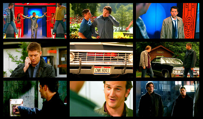
The LICENSE PLATE. The two colors are built into the car Sam and Dean drive! Are you kidding me? [Yea, yea, I know, it’s the license plate for Kripke’s homestate, and has been there for years. Just work with me here.]
All of this finally convinced me to go back to the beginning of the season and see just how prevalent red and blue really have been so far. And the conclusive answer? A RIDICULOUS AMOUNT. To the point where it almost looks like they've forgotten other colors exist!
And all of this isn't just the lighting here. It's wardrobe, set designing, props, lighting and camera choices, all joining forces in this one massive red and blue storm. The heaviest red and blue episodes, besides 5.08, are 5.02, 5.03, and 5.06, but multiple instances can be found in every episode of the season so far.
Take a look at this. And keep in mind, all of this? Is JUST in the first eight episodes.
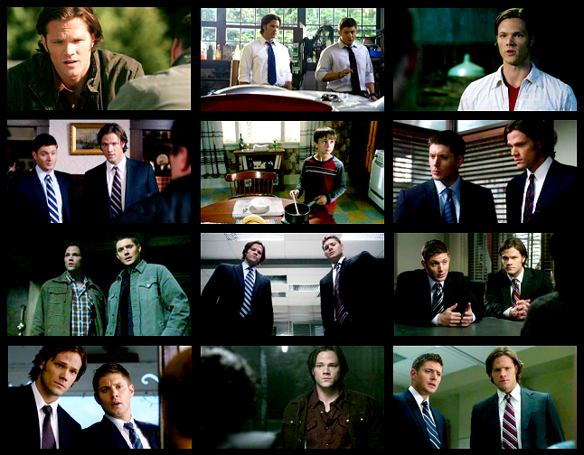
Red and blue fever has taken over wardrobe this season, especially in Sam and Dean’s ties. They literally haven’t worn one color but red and blue all season. And while Sam’s worn more red and Dean’s worn more blue, they’ve swapped colors at least twice so far. As far as shirt colors are concerned, Dean and Sam have both always worn blue so that much isn’t new, but what is interesting is the prevalence of Sam’s red shirts. And look at that red and blue plaid number he had on in 5.06 while using his past experiences to convince Jesse to make the right choice.
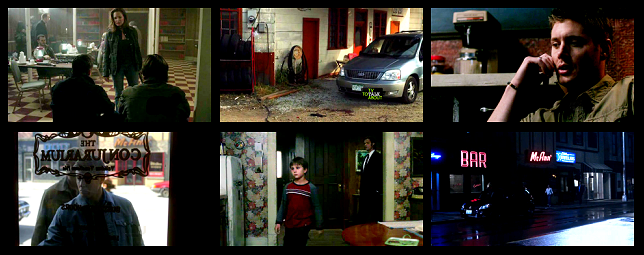
Set designing has been in on the fun as well. Notice that red, white, and blue flower wallpaper in Jesse's kitchen. And the red and blue books on the shelves of the 5.02 church attic.
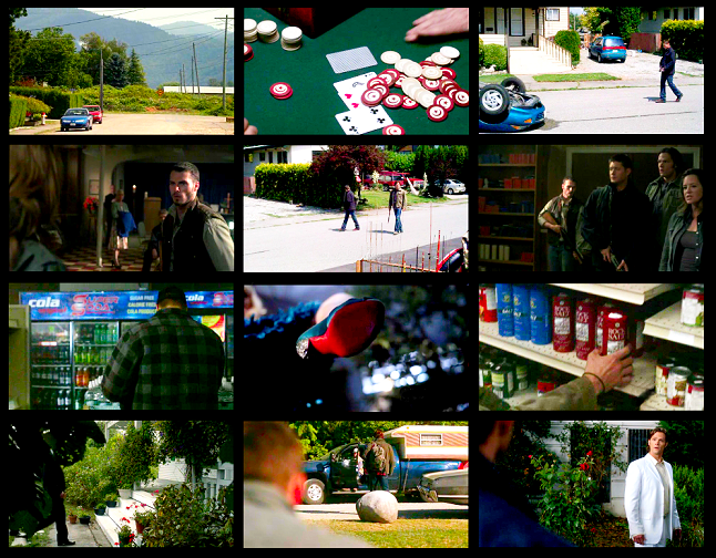
And it’s really infected props. 5.02 was especially ridiculous. As Sam and Dean walk down that road, every car we see is either red, blue, or silver. So by the time I got to the Rock Salt containers I thought, 'ARE YOU KIDDING ME?' Though the Paris Hilton shoe might still be my favorite.
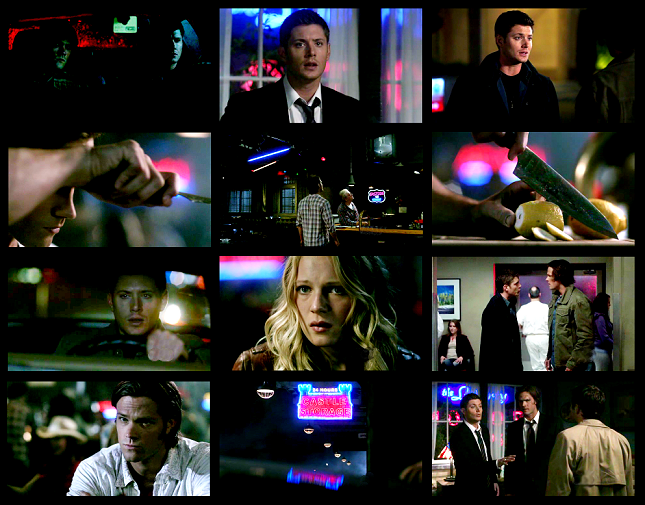
Lighting of course has been in on the action as much as could be expected...
And the camera has shown some very intentional choices to frame shots including both red and blue…
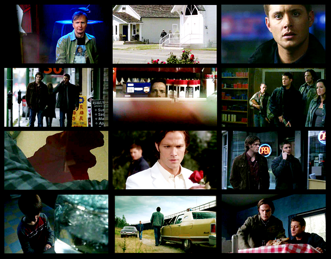
All of this, sets, props, lighting, and shot choice, comes together in what appears to be very deliberate shot compositions using red and blue...
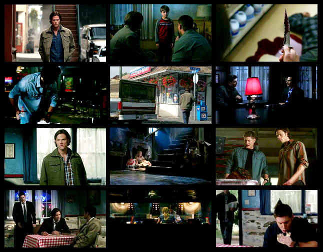
Eight episodes in and already there is a very conscious effort to do something with these colors. But I was just stuck at, what does it all MEANNN? There had to be an explanation that would satisfy me so I would stop thinking about this, right??
So, I figured, let’s start back at the beginning.
BASIC COLOR SYMBOLISM
Cultural identification over the centuries has created a range of different interpretations for each given color. Generally, it's a danger to assign one meaning to a color without taking into consideration the range of meanings one color can give, depending on how and when it's used. There are positive and negatives to both blue and red, and it's important to remember as such when reading scenes in terms of colors.
Some red gives the connotation of ambition, love, passion, strength, will, power, or courage. Too much red can instead give rise to more negative aspects, danger, deceit, anger, rebellion, and war. Similarly, some blue can mean confidence, security, comfort, strength, or love. Yet too much blue can lead to passivity, coldness, sadness, and depression.
Did you notice it there? Both red and blue can symbolize love and strength. Which is incredibly interesting given Kripke has already said this season is about whether the strength and love of a family can save the world.
In fact, one can think of red and blue as related and part of a color spectrum, with love and strength in the middle, its positives close to the center, and its negatives at either extremes.

NOTE: While hearseeno has aligned 'will' with green previously, given this season's use of red and it's long standing use as a color that encourages action, I tend to think red can denote 'will'. I think it is a greater possibility that green is more aligned with hope which we have a tendency to associate with freedom of choice. But that is a post for another time. ;)
Keeping that in mind, look at the instances of pure blue and red used in this season so far.
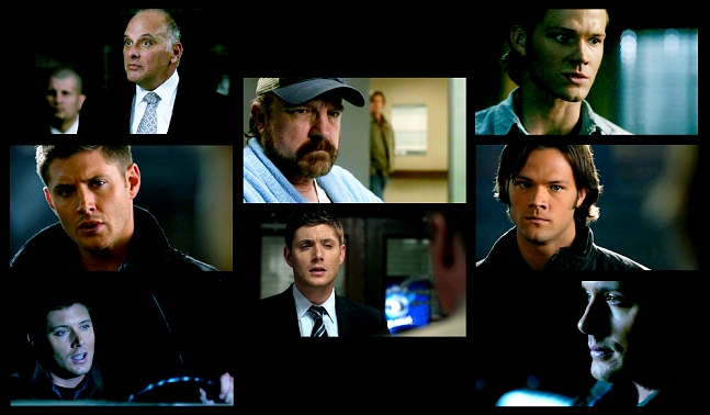
(LEFT: 5.01 [Loyalty/Righteousness]; 5.08 [Wisdom; Conviction]; 5.08 [Denial] | MIDDLE: 5.02 [Passivity, Depression]; 5.05 [Friendly] | RIGHT: 5.03 [Strength]; 5.07 [Confidence/Protection]; 5.03 [Coldness]
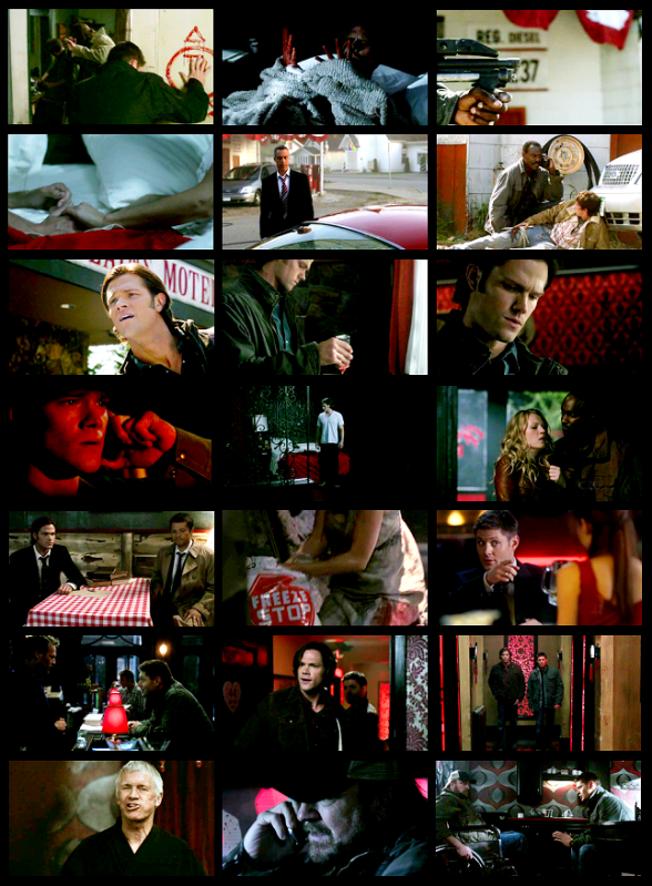
(LEFT: 5.01 [Will]; 5.03 [Deceit]; 5.03 [Control]; 5.03 [Danger]; 5.06 [Will]; 5.07 [Danger]; 5.07 [Guilt] | MIDDLE: 5.01 [Deceit/Guilt/Danger]; 5.02 [War]; 5.03 [Atonement]; 5.03 [Bloodshed]; 5.06 [Will]; 5.07 [Control]; 5.07 [Guilt] | RIGHT: 5.02 [Rebellion]; 5.02 [Trapped by Danger]; 5.03 [Danger]; 5.03 [Anger]; 5.05 [Arrogance]; 5.07 [Sin]; 5.07 [Passion/Aggression/Guilt take your pick])
PSYCHOLOGICAL FACTORS
Research has shown red has the power to quicken the heart and respiration rate. In a small amount, it can add energy or excite. In excess amounts, it cause anxiety and a sense of danger.
On the other hand, research has shown blue can affect the release of chemicals which steadies the heart and respiration rate. In a small amount, it can calm, providing confidence and comfort. In a large amount, it can cause complacence or sadness.
So blue calms. Red excites. And used together, they obtain a certain harmony, balance, or equanimity. Advertising typically pairs the two colors together to create an affinity to the product based on trust and confidence and to encourage the active step of buying the product.
Think of Pepsi.

Or the Obama hope sign.
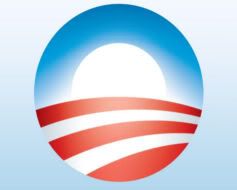
OMG, THAT'S WHAT ALL THE RED AND BLUE ARE SAYING. THE WINCHESTERS SUPPORT OBAMA! Okay. I kid.
COLORS IN FILM
I’d be remiss not to include how colors work in film, because everything that we see does come through a camera lens that has its own faults and constraints.
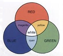
While art operates under the primary colors of red, blue, and yellow, the camera works with a three-color separation filter of red, blue, and green. These primary film colors are called additive colors, and when focused together they yield a white light. Therefore these are the most striking colors one sees in daylight film.
In contrast, film also has subtractive primary colors, cyan, magenta, and yellow. These colors when focused together yield no exposure (or black), and therefore are the main colors picked up by the camera in night filming.
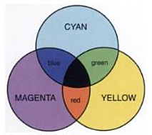
Therefore we could say its just a basic film exception and move on. Especially with this show’s penchant for desaturation, it could be understandable why they might turn to red and blue as the best contrasting colors that stand out. But, we’ve seen the color palette change over the years. S1 actively had blue and green a focus in mostly night shots. And S3 with perhaps the most daylight filming of the series had a yellow color focus. Yet this year has a deliberate lack of yellow and green in favor of red and blue. Further, seeing these colors dominate ‘Changing Channels’, an episode that had regular tv saturation and could have used any number of other colors, tells me it’s not just solely for the desaturation.
As in advertising, red and blue have been wildly successful colors in film, much of which is based on the psychological reaction. The boldness of the colors can be striking contrasts and together the two have made a perfect recipe of beautiful shot compositions in film over the years. (By the way, I have absolutely zero authority on art history, but the contrasts do remind me of a number of stunning Italian Renaissance paintings which employed bright reds and blues too. Was it Raphael who did all those angel paintings? ETA: smilla02 verifies my hazy memory! Botticelli, Beato Angelico, & Piero della Francesca are some other Renaissance painters which relied heavily on reds and blues.)
Specifically dealing with cinematography, much of lighting a scene, especially the actor, deals with adjustment and balance of color temperature. The color temperature spectrum has two extremes, at one end, red. At the other end, blue. At the red end, the picture expresses warmth. At the opposite end, the film gives off hint of coldness. The more tungsten (blue) light has been typical for this show since it’s beginning. Yet warmer temperatures have made its way into the show as well in the last couple years. See the difference color temperature can create:

Left: Warmth | Middle: Normal | Right: Coldness
METAPHORICAL INTERPRETATION
I can imagine there might be a ton of different interpretations for this huge red and blue occurrence this year. But here's mine...
A quick interpretation could be that those powers of Heaven and Hell are both haunting Sam and Dean constantly, hanging just over their shoulders, as the constant threat from both sides weigh them down. And in a way, I think that’s the point of the big red and blue influx in 5x08. But I’d also like to think there’s more to it than just that.
Especially because of its connection to blood, we associate red with evil and danger and death in horror and by extension in SPN. But blood is also the source of life. It is blood that ties a family together. It’s blood that powers us to keep going. To stay alive. To live.
Whedon quotes always invade my brain, but two specifically came to mind while working on this:
ANGELUS: Passion. It lies in all of us. Sleeping...waiting...and though unwanted...unbidden...it will stir...open its jaws, and howl. It speaks to us...guides us. Passion rules us all. And we obey. What other choice do we have? Passion is the source of our finest moments. The joy of love...the clarity of hatred...and the ecstasy of grief. It hurts sometimes more than we can bear. If we could live without passion, maybe we'd know some kind of peace. But we would be hollow. Empty rooms, shuttered and dank. Without passion, we'd truly be dead.
AND
SPIKE: Blood is life, lackbrain. Why do you think we eat it? It's what keeps you going. Makes you warm. Makes you hard. Makes you other than dead.
We forget, red also creates life where there is death. Energy where there is depression. Just as blue creates rationality where there is recklessness. Together, they balance each other.
Both ancient Greek and Chinese philosophies considered two elements as the dualism of the cosmos: Fire and Water. Denoted by, yes, the colors red and blue. The belief is that the balance of the universe is only achieved when these two forces are present together, each assuaging the other element’s extremes. Even Shakespeare’s work revolves around water and fire as the primary and most important forces at work in the universe.
Existing still today as a key principle of Chinese religions and medicine, this relationship is more popularly known as the Yin/Yang Principle. We have already seen The Five Elements featured by the show's credits each season as blacklid has highlighted nicely HERE. So I actually don't think it’s too far off to make this following conjecture.
Because Fire and Water can typically be assigned to personality of a person.
While both boys possess Fire and Water aspects (both positive and negative), each do trend toward one. Sam, with his ambition but tendency for rebellion, trends toward Fire. Dean, with his rationality and loyalty but tendency for coldness, trends toward Water. We can see this in their reactions to one another’s deaths. Dean slips into such depression he commits himself to death. Sam angers and seeks control and vengeance. Future!Dean's almost complete absence of life only further confirms this.
So, if we align red with Sam and blue with Dean, then hey, look, Gabriel was right, Sam and Dean are the center of the universe!
But I want to go one step further with this.
Chinese medicine operates under the belief that your body is like a microcosm of the universe. Therefore you are only healthy when your Yin (Water) and Yang (Fire) is equal. Only then is your body in balance and harmony. At either extreme, too much Yin or too much Yang, is a recipe for sickness.
I say this because this can apply, both to Dean and Sam individually as it applies to psychological wellness, and as a unit, as it applies to their functionality. The last three years, both have deviated wildly from the center. But after the fall out of last season, and the end of the world, they have both each come back to their centers. Therefore, does all of this red and blue together in the same shot signal some type of balance and equanimity? What does that mean for the fate of the world?
Notice how the inclusion of red from one origin and blue from another balance these shots.
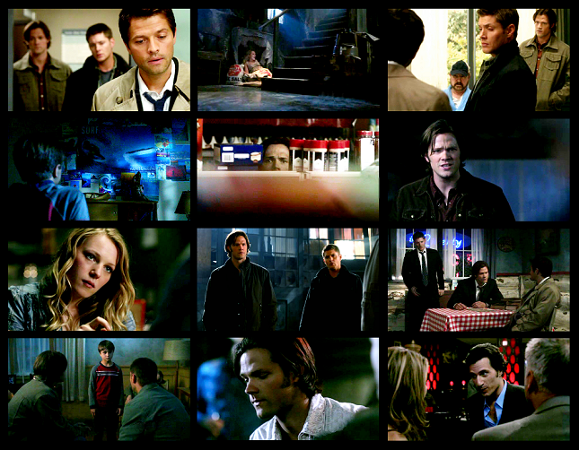
Perhaps my favorite of all of those is Jesse's mom in 5.06. The red of the salt bag reminding us of the violation of her body, yet also her will to grab the salt, shove it down her throat, and expell the demon, giving her some sort of peace, as the blue light shines through the window. This is personal balance. But many of these shots include more than one person, as in the top left. Together, Sam's red shirt and Dean and Cas's blue even out. Because of red's strength, it is generally thought that more blue is needed than red in order to achieve this color balance.
Fate vs. Free Will
So let's look at the extremes for a second. Warm vs. Cold. Irrational vs. Rational. Action vs. Passive. Hell vs. Heaven. Free Will vs. Fate?
Heaven, and by relation the angels, has always been about passive action. This is how it is written, this is how it will be, don't think about changing it, just do your job and don't question. They have loyalty to God, confidence in The Word, and security from their position. And it has shown us that while this can be considered positive, it‘s not always necessarily a good thing. At its extreme, we have Castiel in Season Four, who found out what was happening and yet stayed silent. Exercised his orders. Remained loyal. Until he rebelled, exercised his free will through an action (characterized by the red blood on the wall) and obtained a certain self-equanimity.
Meanwhile, with evil we have the absolute other extreme. The very conception of evil began at Lucifer's deception, the very first action of free will. Out of passion and out of arrogance, he rebelled against God. Out of anger, he took angels with him to deceive humans and make his point to God. Out of vengeance, he turned God’s precious humans into demons. These very actions show the danger involved in free will. Life seems wholly pointless without it and yet to have free will, also comes with a responsibility to do the right and just thing. Abuse of the power of free will for unjust means and suddenly free will is not a wholly positive conception.
For a while now I have been hoping free will makes a victorious comeback. But I had forgotten that free will in its purest and most unadulterated form can be dangerous privilege to give. At its extreme we have Lucifer and his demons who can reek havoc anywhere they want and do anything. Yet at the opposite end we have the angels and their precious fate they've resigned themselves to.
And so at the core argument of fate vs. free will, we have the comparison between passivity and action. The answer is not that one is right over the other. It’s that there is a balance between the two that results in the most optimal solution. Press forward, but with prudence.
The Land of The Free and the Home of the Brave
Because we've had two episodes in the span of eight that have had hugely patriotic themes for the set, as well as at least one strategically placed flag every episode, I would be remiss not to include this. Look at all flags and allusions to America.
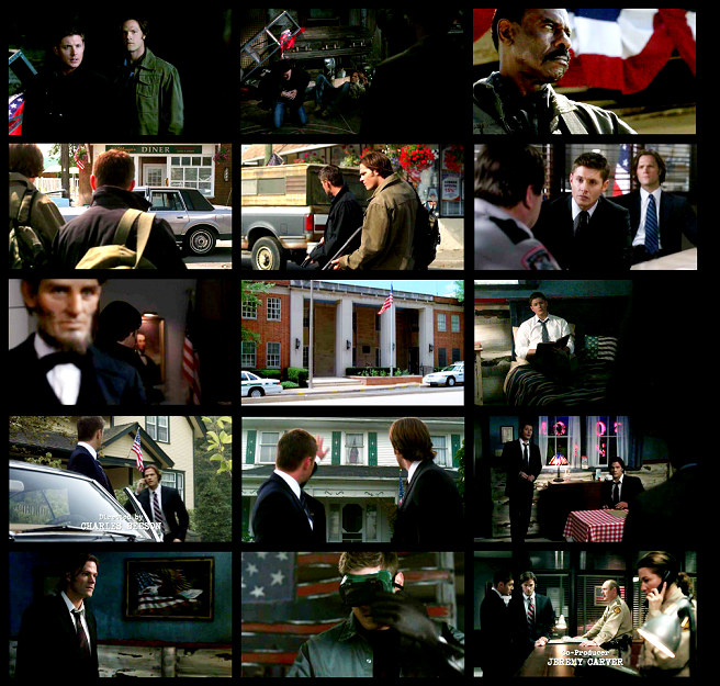
And you can note that many of the red and blue instances I showcased above also included white as well.
The easy explanation is that they’re playing up the idea that hunters are analogous to soldiers fighting to keep a world alive, in this case the country this very American drama takes place in. But not all hunters get the red & blue privilege. The hunters that harassed Sam in 5x03 were only aligned with red. Anger. Power. War.
You could say that their alluding to a political meta, and just switching up the red and blue between republicans and democrats. After all that red and blue spectrum does look an awful like a political ideology spectrum, ranging from Anarchy (Red/Hell) to Totalitarianism (Blue/Heaven), with U.S. independents tending to far exactly in the middle. But that’s potentially sticky territory as well.
The U.S flag’s colors could in one phrase be captured by “freedom with justice”. While the founders never outlined exactly what each color in the flag symbolized, they did for the U.S. Seal. Charles Thompson, Secretary of the Continental Congress, reporting to Congress on the Seal, stated:
"The colors of the pales (the vertical stripes) are those used in the flag of the United States of America; White signifies purity and innocence, Red, hardiness & valor, and Blue, the color of the Chief (the broad band above the stripes) signifies vigilance, perseverance & justice."
Since then people have speculated what the colors of the U.S. flag have come to symbolize over time. The white color signifies purity and peace. The red hue symbolizes valor, courage, enthusiasm, blood and life while the blue color indicates perseverance, justice, vigilance and respect for God. Mostly, its colors unite a vast span of citizens of the country toward one common goal.
Supernatural has always been intensely humanistic, and this idea of conscious morality comes right to the core of America’s founding idealism. The idea that all people should be allowed freedom and equality, but at a price of being held accountable for their actions. That any unjust action is must be punished. Freedom with justice.
I had a political science teacher that once told me, that pragmatism can best be thought of as the most practical way of using both political parties ideologies to get the job done as successfully as possible. Perhaps not the most accurate definition possible and yet it’s an interesting thing to think about in terms of this show. Because if there was any word to describe the Winchester Way, it’d be pragmatism.
This brings me back to ‘The End’ and I think goes to the heart of what is meant by the idea that Dean and Sam keep each other human. Together, their contrasts weighed together come to an equilibrium. Together, they keep keep each other sane and straight-focused. Sam makes Dean think twice about simply killing humans before trying reason in 'Nightmares', 'Bloodlust', and 'Croatoan'. Dean reasons Sam over delusions in 'Jus in Bello' and 'Time is On My Side'. They argue and they fight but in the end, they balance each other out. Left to their own devices, I don't trust either one of them. Who can forget Dean pulling Sam back from throwing himself in the fire in 'Salvation'. Or Sam not allowing Dean to hold off the demons by himself in 'Magnificent Seven'. When either one of them dies, bad things happen. And 'The End' showed us when they go off on their own for good, bad things happen as well.
In the end, they’re stronger when they work together because they bring both sides to the table. In other words, their strength lies in more than just the sum of their parts, but in how they can keep each other in check. So I would assert that this too signals that this season is all about them finding that equilibrium both within themselves and their relationship. And perhaps suggests this will lead to the universe coming back into balance as well?
Of course you can chalk this up to me wanting to find validity for hope this season.
THE HOPE EQUATION: RED + BLUE = SAM + DEAN = WORLD SAVED!! *g*
But if I could seriously posit one thing, it would be that it is not simply that we should fear any existence of red in the Supernatural world. Rather, that either red or blue can be dangerous when left to its own extremes. But that appearing together, they can signal very human push and pull struggle between two forces, and represent a larger idea of achieving balance and equanimity in the world.
I think we can learn a lot about the season based on these colors and I could go into the specifics of each frame used above, but I'd be here for hours. Still, I urge you all to do so yourselves! For just a taste of what these colors might be able to tell us, I think it’s interesting to see who has been associated with the 'red-and-blue' so far this season:
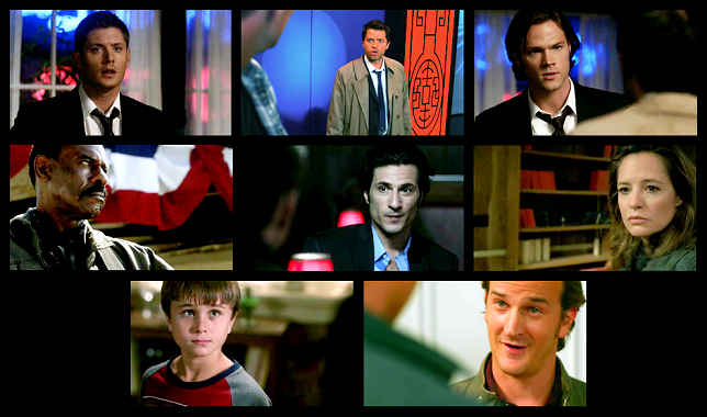
Kinda makes you think, doesn't it?
Whew! That was kinda exhausting. NEW WINCHESTERS TONIGHT!
This thing got ridiculously massive very quickly, I blame it all on Serge Ladouceur for making me all thinky. I want my brain back, Serge!
I recognize whenever we start talking about colors we pass into nebulous territory, so you can take this all with the grain of salt it is. But the usage of colors red and blue by production design and cinematography in Supernatural have had me curious for years. And this season, with an increased prominence of these two colors together consciously placed within the same shot, finally made me organize my thoughts in one place. Includes picspam evidence from the first eight episodes, some background on the colors of red and blue, and my own interpretation of its meaning.

'The Balance of Red & Blue': Color Symbolism in context of Fate & Free Will in SPN S5 (so far!)
The colors of red and blue are no strangers to this show, they've shown up frequently in past seasons as bowtrunckle, hearseeno, & sadelyrate have shown in their color symbolism posts in the past. But the balance employed between the two has become especially striking this season, and I just haven't been able to get them out of my head.
To my knowledge, prior to this season, on an episode-by-episode/scene-by-scene basis, these colors have been used sparingly. The majority of the show's palette has always been confined to more neutral, washed-out colors and dark backgrounds. But each season has had a predominantly associated color. Season 1's major color palette was of blue and green hues. Season 2's major color palette faded to even less color, though trending toward less blue, and more green. Season 3's major color palette is largely regarded as predominately yellow. And Season 4's had the most red, warmth hues we've seen yet, primarily seen in dealing with Sam, Ruby, and Dean's Hell experiences. But on the flip, we also had some blue hues reappear with the angels introduction, predominately used to characterized Castiel (right down to his blue tie).
Yet this year, there seems to be a real strong red and blue theme. Not just appearing in separate instances like last season, but together. That is, both colors existing in the same shot in a way that seems to signal an intentional attempt to balance both colors.
dotfic has showcased some of the red and blue used in 5.04, 5.06, and 5.07 so far this season. And I touched on it briefly in my meta picspam on 5.04's lighting HERE. But what was the main purpose of these colors? I’ll admit it's been driving me kinda crazy. Why all the increased occurrence of red and blue this season, to the point where it feels like the show doesn't even care about any other color these days?
I had almost convinced myself that the lighting and set people must be doing different things, because the color usages were giving me mixed signals from objects to backlighting to foreground lighting. But that didn‘t seem right, they should all be working in concert. It is after all the DP’s job to coordinate everyone. And it couldn’t be some random out of the blue point either, because they should be subservient to the text just as scoring should be. So it must serve the overall season‘s theme, right?
Then I saw ‘Changing Channels’, and look at all of this red and blue!! If anything was a CONSCIOUS choice, it was this. Here we have saturated film and yet still have these two colors everywhere. Red and blue included intentionally in almost every shot!
Obviously I can’t cap it all, but I’m not exaggerating when I say almost every shot in the hospital had a red sign to complement the boys' blue scrubs and white doctor coats.

Then the CSI spoof was also ALL red and blue. Everyone was wearing blue, while the red blood and heart staking were accented. And we had that red lollipop used in every shot they could. Plus, every single shot of the boys had red, white, and blue lights behind them. Obviously from a police car, as is the standard shot for cop dramas. If we hadn‘t already had multiple instances of these paired light colors before, it would mean nothing. But we have.

Still not convinced? Here’s red and blue in the rest of the episode. I’ll tell you, it took me until getting to the Knight Rider segment that I about spit out my coffee. ‘Cause that’s when I noticed...

The LICENSE PLATE. The two colors are built into the car Sam and Dean drive! Are you kidding me? [Yea, yea, I know, it’s the license plate for Kripke’s homestate, and has been there for years. Just work with me here.]
All of this finally convinced me to go back to the beginning of the season and see just how prevalent red and blue really have been so far. And the conclusive answer? A RIDICULOUS AMOUNT. To the point where it almost looks like they've forgotten other colors exist!
And all of this isn't just the lighting here. It's wardrobe, set designing, props, lighting and camera choices, all joining forces in this one massive red and blue storm. The heaviest red and blue episodes, besides 5.08, are 5.02, 5.03, and 5.06, but multiple instances can be found in every episode of the season so far.
Take a look at this. And keep in mind, all of this? Is JUST in the first eight episodes.
Red and blue fever has taken over wardrobe this season, especially in Sam and Dean’s ties. They literally haven’t worn one color but red and blue all season. And while Sam’s worn more red and Dean’s worn more blue, they’ve swapped colors at least twice so far. As far as shirt colors are concerned, Dean and Sam have both always worn blue so that much isn’t new, but what is interesting is the prevalence of Sam’s red shirts. And look at that red and blue plaid number he had on in 5.06 while using his past experiences to convince Jesse to make the right choice.

Set designing has been in on the fun as well. Notice that red, white, and blue flower wallpaper in Jesse's kitchen. And the red and blue books on the shelves of the 5.02 church attic.

And it’s really infected props. 5.02 was especially ridiculous. As Sam and Dean walk down that road, every car we see is either red, blue, or silver. So by the time I got to the Rock Salt containers I thought, 'ARE YOU KIDDING ME?' Though the Paris Hilton shoe might still be my favorite.

Lighting of course has been in on the action as much as could be expected...

And the camera has shown some very intentional choices to frame shots including both red and blue…

All of this, sets, props, lighting, and shot choice, comes together in what appears to be very deliberate shot compositions using red and blue...

Eight episodes in and already there is a very conscious effort to do something with these colors. But I was just stuck at, what does it all MEANNN? There had to be an explanation that would satisfy me so I would stop thinking about this, right??
So, I figured, let’s start back at the beginning.
BASIC COLOR SYMBOLISM
Cultural identification over the centuries has created a range of different interpretations for each given color. Generally, it's a danger to assign one meaning to a color without taking into consideration the range of meanings one color can give, depending on how and when it's used. There are positive and negatives to both blue and red, and it's important to remember as such when reading scenes in terms of colors.
Some red gives the connotation of ambition, love, passion, strength, will, power, or courage. Too much red can instead give rise to more negative aspects, danger, deceit, anger, rebellion, and war. Similarly, some blue can mean confidence, security, comfort, strength, or love. Yet too much blue can lead to passivity, coldness, sadness, and depression.
Did you notice it there? Both red and blue can symbolize love and strength. Which is incredibly interesting given Kripke has already said this season is about whether the strength and love of a family can save the world.
In fact, one can think of red and blue as related and part of a color spectrum, with love and strength in the middle, its positives close to the center, and its negatives at either extremes.

NOTE: While hearseeno has aligned 'will' with green previously, given this season's use of red and it's long standing use as a color that encourages action, I tend to think red can denote 'will'. I think it is a greater possibility that green is more aligned with hope which we have a tendency to associate with freedom of choice. But that is a post for another time. ;)
Keeping that in mind, look at the instances of pure blue and red used in this season so far.

(LEFT: 5.01 [Loyalty/Righteousness]; 5.08 [Wisdom; Conviction]; 5.08 [Denial] | MIDDLE: 5.02 [Passivity, Depression]; 5.05 [Friendly] | RIGHT: 5.03 [Strength]; 5.07 [Confidence/Protection]; 5.03 [Coldness]

(LEFT: 5.01 [Will]; 5.03 [Deceit]; 5.03 [Control]; 5.03 [Danger]; 5.06 [Will]; 5.07 [Danger]; 5.07 [Guilt] | MIDDLE: 5.01 [Deceit/Guilt/Danger]; 5.02 [War]; 5.03 [Atonement]; 5.03 [Bloodshed]; 5.06 [Will]; 5.07 [Control]; 5.07 [Guilt] | RIGHT: 5.02 [Rebellion]; 5.02 [Trapped by Danger]; 5.03 [Danger]; 5.03 [Anger]; 5.05 [Arrogance]; 5.07 [Sin]; 5.07 [Passion/Aggression/Guilt take your pick])
PSYCHOLOGICAL FACTORS
Research has shown red has the power to quicken the heart and respiration rate. In a small amount, it can add energy or excite. In excess amounts, it cause anxiety and a sense of danger.
On the other hand, research has shown blue can affect the release of chemicals which steadies the heart and respiration rate. In a small amount, it can calm, providing confidence and comfort. In a large amount, it can cause complacence or sadness.
So blue calms. Red excites. And used together, they obtain a certain harmony, balance, or equanimity. Advertising typically pairs the two colors together to create an affinity to the product based on trust and confidence and to encourage the active step of buying the product.
Think of Pepsi.

Or the Obama hope sign.

OMG, THAT'S WHAT ALL THE RED AND BLUE ARE SAYING. THE WINCHESTERS SUPPORT OBAMA! Okay. I kid.
COLORS IN FILM
I’d be remiss not to include how colors work in film, because everything that we see does come through a camera lens that has its own faults and constraints.
While art operates under the primary colors of red, blue, and yellow, the camera works with a three-color separation filter of red, blue, and green. These primary film colors are called additive colors, and when focused together they yield a white light. Therefore these are the most striking colors one sees in daylight film.

In contrast, film also has subtractive primary colors, cyan, magenta, and yellow. These colors when focused together yield no exposure (or black), and therefore are the main colors picked up by the camera in night filming.

Therefore we could say its just a basic film exception and move on. Especially with this show’s penchant for desaturation, it could be understandable why they might turn to red and blue as the best contrasting colors that stand out. But, we’ve seen the color palette change over the years. S1 actively had blue and green a focus in mostly night shots. And S3 with perhaps the most daylight filming of the series had a yellow color focus. Yet this year has a deliberate lack of yellow and green in favor of red and blue. Further, seeing these colors dominate ‘Changing Channels’, an episode that had regular tv saturation and could have used any number of other colors, tells me it’s not just solely for the desaturation.
As in advertising, red and blue have been wildly successful colors in film, much of which is based on the psychological reaction. The boldness of the colors can be striking contrasts and together the two have made a perfect recipe of beautiful shot compositions in film over the years. (By the way, I have absolutely zero authority on art history, but the contrasts do remind me of a number of stunning Italian Renaissance paintings which employed bright reds and blues too. Was it Raphael who did all those angel paintings? ETA: smilla02 verifies my hazy memory! Botticelli, Beato Angelico, & Piero della Francesca are some other Renaissance painters which relied heavily on reds and blues.)
Specifically dealing with cinematography, much of lighting a scene, especially the actor, deals with adjustment and balance of color temperature. The color temperature spectrum has two extremes, at one end, red. At the other end, blue. At the red end, the picture expresses warmth. At the opposite end, the film gives off hint of coldness. The more tungsten (blue) light has been typical for this show since it’s beginning. Yet warmer temperatures have made its way into the show as well in the last couple years. See the difference color temperature can create:

Left: Warmth | Middle: Normal | Right: Coldness
METAPHORICAL INTERPRETATION
I can imagine there might be a ton of different interpretations for this huge red and blue occurrence this year. But here's mine...
A quick interpretation could be that those powers of Heaven and Hell are both haunting Sam and Dean constantly, hanging just over their shoulders, as the constant threat from both sides weigh them down. And in a way, I think that’s the point of the big red and blue influx in 5x08. But I’d also like to think there’s more to it than just that.
Especially because of its connection to blood, we associate red with evil and danger and death in horror and by extension in SPN. But blood is also the source of life. It is blood that ties a family together. It’s blood that powers us to keep going. To stay alive. To live.
Whedon quotes always invade my brain, but two specifically came to mind while working on this:
ANGELUS: Passion. It lies in all of us. Sleeping...waiting...and though unwanted...unbidden...it will stir...open its jaws, and howl. It speaks to us...guides us. Passion rules us all. And we obey. What other choice do we have? Passion is the source of our finest moments. The joy of love...the clarity of hatred...and the ecstasy of grief. It hurts sometimes more than we can bear. If we could live without passion, maybe we'd know some kind of peace. But we would be hollow. Empty rooms, shuttered and dank. Without passion, we'd truly be dead.
AND
SPIKE: Blood is life, lackbrain. Why do you think we eat it? It's what keeps you going. Makes you warm. Makes you hard. Makes you other than dead.
We forget, red also creates life where there is death. Energy where there is depression. Just as blue creates rationality where there is recklessness. Together, they balance each other.
Both ancient Greek and Chinese philosophies considered two elements as the dualism of the cosmos: Fire and Water. Denoted by, yes, the colors red and blue. The belief is that the balance of the universe is only achieved when these two forces are present together, each assuaging the other element’s extremes. Even Shakespeare’s work revolves around water and fire as the primary and most important forces at work in the universe.
Existing still today as a key principle of Chinese religions and medicine, this relationship is more popularly known as the Yin/Yang Principle. We have already seen The Five Elements featured by the show's credits each season as blacklid has highlighted nicely HERE. So I actually don't think it’s too far off to make this following conjecture.
Because Fire and Water can typically be assigned to personality of a person.
While both boys possess Fire and Water aspects (both positive and negative), each do trend toward one. Sam, with his ambition but tendency for rebellion, trends toward Fire. Dean, with his rationality and loyalty but tendency for coldness, trends toward Water. We can see this in their reactions to one another’s deaths. Dean slips into such depression he commits himself to death. Sam angers and seeks control and vengeance. Future!Dean's almost complete absence of life only further confirms this.
So, if we align red with Sam and blue with Dean, then hey, look, Gabriel was right, Sam and Dean are the center of the universe!
But I want to go one step further with this.
Chinese medicine operates under the belief that your body is like a microcosm of the universe. Therefore you are only healthy when your Yin (Water) and Yang (Fire) is equal. Only then is your body in balance and harmony. At either extreme, too much Yin or too much Yang, is a recipe for sickness.
I say this because this can apply, both to Dean and Sam individually as it applies to psychological wellness, and as a unit, as it applies to their functionality. The last three years, both have deviated wildly from the center. But after the fall out of last season, and the end of the world, they have both each come back to their centers. Therefore, does all of this red and blue together in the same shot signal some type of balance and equanimity? What does that mean for the fate of the world?
Notice how the inclusion of red from one origin and blue from another balance these shots.

Perhaps my favorite of all of those is Jesse's mom in 5.06. The red of the salt bag reminding us of the violation of her body, yet also her will to grab the salt, shove it down her throat, and expell the demon, giving her some sort of peace, as the blue light shines through the window. This is personal balance. But many of these shots include more than one person, as in the top left. Together, Sam's red shirt and Dean and Cas's blue even out. Because of red's strength, it is generally thought that more blue is needed than red in order to achieve this color balance.
Fate vs. Free Will
So let's look at the extremes for a second. Warm vs. Cold. Irrational vs. Rational. Action vs. Passive. Hell vs. Heaven. Free Will vs. Fate?
Heaven, and by relation the angels, has always been about passive action. This is how it is written, this is how it will be, don't think about changing it, just do your job and don't question. They have loyalty to God, confidence in The Word, and security from their position. And it has shown us that while this can be considered positive, it‘s not always necessarily a good thing. At its extreme, we have Castiel in Season Four, who found out what was happening and yet stayed silent. Exercised his orders. Remained loyal. Until he rebelled, exercised his free will through an action (characterized by the red blood on the wall) and obtained a certain self-equanimity.
Meanwhile, with evil we have the absolute other extreme. The very conception of evil began at Lucifer's deception, the very first action of free will. Out of passion and out of arrogance, he rebelled against God. Out of anger, he took angels with him to deceive humans and make his point to God. Out of vengeance, he turned God’s precious humans into demons. These very actions show the danger involved in free will. Life seems wholly pointless without it and yet to have free will, also comes with a responsibility to do the right and just thing. Abuse of the power of free will for unjust means and suddenly free will is not a wholly positive conception.
For a while now I have been hoping free will makes a victorious comeback. But I had forgotten that free will in its purest and most unadulterated form can be dangerous privilege to give. At its extreme we have Lucifer and his demons who can reek havoc anywhere they want and do anything. Yet at the opposite end we have the angels and their precious fate they've resigned themselves to.
And so at the core argument of fate vs. free will, we have the comparison between passivity and action. The answer is not that one is right over the other. It’s that there is a balance between the two that results in the most optimal solution. Press forward, but with prudence.
The Land of The Free and the Home of the Brave
Because we've had two episodes in the span of eight that have had hugely patriotic themes for the set, as well as at least one strategically placed flag every episode, I would be remiss not to include this. Look at all flags and allusions to America.

And you can note that many of the red and blue instances I showcased above also included white as well.
The easy explanation is that they’re playing up the idea that hunters are analogous to soldiers fighting to keep a world alive, in this case the country this very American drama takes place in. But not all hunters get the red & blue privilege. The hunters that harassed Sam in 5x03 were only aligned with red. Anger. Power. War.
You could say that their alluding to a political meta, and just switching up the red and blue between republicans and democrats. After all that red and blue spectrum does look an awful like a political ideology spectrum, ranging from Anarchy (Red/Hell) to Totalitarianism (Blue/Heaven), with U.S. independents tending to far exactly in the middle. But that’s potentially sticky territory as well.
The U.S flag’s colors could in one phrase be captured by “freedom with justice”. While the founders never outlined exactly what each color in the flag symbolized, they did for the U.S. Seal. Charles Thompson, Secretary of the Continental Congress, reporting to Congress on the Seal, stated:
"The colors of the pales (the vertical stripes) are those used in the flag of the United States of America; White signifies purity and innocence, Red, hardiness & valor, and Blue, the color of the Chief (the broad band above the stripes) signifies vigilance, perseverance & justice."
Since then people have speculated what the colors of the U.S. flag have come to symbolize over time. The white color signifies purity and peace. The red hue symbolizes valor, courage, enthusiasm, blood and life while the blue color indicates perseverance, justice, vigilance and respect for God. Mostly, its colors unite a vast span of citizens of the country toward one common goal.
Supernatural has always been intensely humanistic, and this idea of conscious morality comes right to the core of America’s founding idealism. The idea that all people should be allowed freedom and equality, but at a price of being held accountable for their actions. That any unjust action is must be punished. Freedom with justice.
I had a political science teacher that once told me, that pragmatism can best be thought of as the most practical way of using both political parties ideologies to get the job done as successfully as possible. Perhaps not the most accurate definition possible and yet it’s an interesting thing to think about in terms of this show. Because if there was any word to describe the Winchester Way, it’d be pragmatism.
This brings me back to ‘The End’ and I think goes to the heart of what is meant by the idea that Dean and Sam keep each other human. Together, their contrasts weighed together come to an equilibrium. Together, they keep keep each other sane and straight-focused. Sam makes Dean think twice about simply killing humans before trying reason in 'Nightmares', 'Bloodlust', and 'Croatoan'. Dean reasons Sam over delusions in 'Jus in Bello' and 'Time is On My Side'. They argue and they fight but in the end, they balance each other out. Left to their own devices, I don't trust either one of them. Who can forget Dean pulling Sam back from throwing himself in the fire in 'Salvation'. Or Sam not allowing Dean to hold off the demons by himself in 'Magnificent Seven'. When either one of them dies, bad things happen. And 'The End' showed us when they go off on their own for good, bad things happen as well.
In the end, they’re stronger when they work together because they bring both sides to the table. In other words, their strength lies in more than just the sum of their parts, but in how they can keep each other in check. So I would assert that this too signals that this season is all about them finding that equilibrium both within themselves and their relationship. And perhaps suggests this will lead to the universe coming back into balance as well?
Of course you can chalk this up to me wanting to find validity for hope this season.
THE HOPE EQUATION: RED + BLUE = SAM + DEAN = WORLD SAVED!! *g*
But if I could seriously posit one thing, it would be that it is not simply that we should fear any existence of red in the Supernatural world. Rather, that either red or blue can be dangerous when left to its own extremes. But that appearing together, they can signal very human push and pull struggle between two forces, and represent a larger idea of achieving balance and equanimity in the world.
I think we can learn a lot about the season based on these colors and I could go into the specifics of each frame used above, but I'd be here for hours. Still, I urge you all to do so yourselves! For just a taste of what these colors might be able to tell us, I think it’s interesting to see who has been associated with the 'red-and-blue' so far this season:

Kinda makes you think, doesn't it?
Whew! That was kinda exhausting. NEW WINCHESTERS TONIGHT!