Texture Usage Guide
This is a comprehensive guide covering texture usage, that also touches briefly on coloring. It is intended to help beginners take the next step to intermediate icon-making. It does not cover cropping, resizing, brush usage, blending, etc. It is definitely text heavy.
First off, if you don't know your superduper basics, this is not going to do much for you. Make sure you know the tools of your program first. Check out the below links for tool guides.
Photoshop: http://ealias.livejournal.com/60071.html
Paint Shop Pro translation: http://community.livejournal.com/icon_tutorial/353615.html
Now, a few notes on coloring.
Most people find one tool they like for coloring and stick with it for the most of their basic coloring needs. For me, it's curves, but others use levels, selective coloring, or even fill layers as their main tool. The trick to improving here is to become extremely comfortable and efficient in using your tool of choice, and then learn to not abuse it. So practice, practice, practice on many different kinds of pictures. What I really suggest is play around a lot without being too fixated on achieving a final product; set aside an hour or so to mess around with your program without feeling obligated to produce any icons by the end, and just concentrate on noticing how each change you make affects the image, whether it looks good or not.
Guide to curves:
http://community.livejournal.com/icon_tutorial/10049943.html
Guide to selective color:
http://community.livejournal.com/pixelfun/12276.html
Guide to levels (also talks about curves):
http://community.livejournal.com/icon_tutorial/5678575.html
Guides to layers/layer modes:
exclusion layers -
http://community.livejournal.com/icon_tutorial/8450713.html
various blend modes -
http://community.livejournal.com/icon_tutorial/3549508.html
http://community.livejournal.com/icon_tutorial/3029342.html
explanation of layer modes (pics not working) -
http://maura-icons.livejournal.com/5874.html
Some tips on coloring
As I'm sure is abundantly obvious (especially to anyone who's ever visited ugly_icons), what constitutes good coloring is extremely subjective. However, most people agree that extremes of any kind should be avoided. Really overly saturated images, especially those containing people, should be avoided, as well as extremely washed out icons (however, brightly saturated icons and moderately muted icons can make for a nice style). Drastically altering the natural coloring of human skin is also something that can be off putting. In the case of using a colored texture over the whole image, it may work, but in general, people tend to look ill if their skin veers too far away from pink and peach hues and too close to blue or green hues.
Many people use multiple coloring steps through making one icon, especially if they use textures. My process usually involves an initial contrast/saturation/hue clean up of the picture right before or after cropping and resizing, at least one revisit to coloring throughout the process (of adding textures, etc.), and I often end with a final minor color adjustment. This is why it's important to become efficient at using your tool, and to not fall into bad habits.
And now onto the meat of the tutorial: textures!
I generally break down my textures into two main groups: general textures and specialty textures. The general textures are usually used for "general" texture purposes, and are probably able to be used in many versatile ways, whereas the specialty textures are used to achieve a specific look or effect. There are many subcategories of specialty textures, and each one is usually used in one of only a few ways.
First, we'll talk about specialty textures.
Specialty Textures: Grunge/Scratch
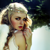
These add a dirty, aged, grungy, or scratched quality to your icon. There are two main ways to use these. If you want the grunge to show up as light spots on the image (this usually makes for a cleaner look) make sure that the background is dark and the scratches/dirt/etc. is light. This may mean you have to invert the texture. Then, place it on a layer above your base and set the layer to screen (or try lighten or dodge, for slightly different effects). Usually this layer is kept on a high opacity, but you can play around with contrast of the layer if you want to strengthen or dull the effect.
If you want the grunge to show up as darker than the image - this can really make the icon look genuinely dirty - make sure that the background is light and the grunge is dark (again, invert if necessary). Place the layer above the image and set it to multiply (or experiment with darken or burn). A lowered opacity might be appropriate, and again you can play with contrast of the texture layer.
Examples - please note that all the examples in this tutorial are not necessarily meant to be finished icons, I only wanted to show the effect of the texture in isolation:
+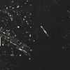
, set to screen, flipped horizontally, parts over the subject erased =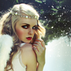
texture by azuremonkey

+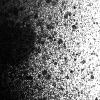
, set to multiply, parts over the subject erased =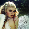
texture by icecrusher_i_b
Specialty Textures: Light Blobs, Swirls, etc.
These add a lighter highlight to an area or areas of the image where the texture is light. Use these by placing them on a layer above your base and setting them to screen or lighten. Good ways to alter these include changing the hue or saturation of the texture, applying a gaussian blur, lowering their opacity, or increasing their contrast. While these are good for drawing attention to an area, but make sure that you don't end up obscuring your focus by making it too light.

+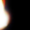
, flipped horizontally, desaturated, and set to screen =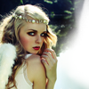
texture by waiting_minds

+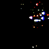
, set to linear dodge, gaussian blur =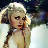
texture by icecrusher_i_b
Specialty Textures: Bold Patterns
These can be used as a background for your subject, or to cover parts of an image. To use as a background, you can place it behind your base and mask/erase the parts of the base that you don't want. In this case, leave the texture layer settings on normal, unless you have other layers below it. You can try different layer settings, like multiply or darken, on the upper layer that contains your subject. Alternatively, you can place the texture above the base and mask/erase parts of the texture to show the subject. Leave the texture layer on normal layer settings or play around (maybe multiply, hard light, pin light) for different effects.
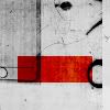
+
, resized and desaturated =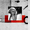
texture by metaspeshul
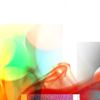
+
, resized, desaturated, set to multiply, background erased =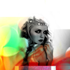
texture by cowsparkle
Specialty Textures: Decorations
These do exactly what the name says. How they are used really depends on the texture. Ones that have a dark background with a light decoration can be used like light textures, set to screen or lighten. Ones that have a light background with a dark decoration can be set to multiply. (For both of these, remember that you can always try inverting the texture so that you can use the other method.) Many decorations can also have their backgrounds removed, so that they can be used on a normal layer setting - you can try carefully erasing with the eraser tool or using a mask layer, or use the selection tool to delete or mask the the background.

+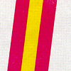
, moved over, white part deleted =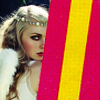
texture by daintybird

+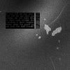
, inverted, set to screen, unwanted parts deleted, repositioned =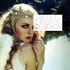
texture by metaspeshul
Specialty Textures: Text
Text textures can be used if you don't want to write your own text. They may also include a decoration, grunge, or light blob element. Personally, I'm a huge fan of text textures because I usually use them to add a je ne sais quoi to an otherwise plain icon rather than having relevant, legible text. These are used pretty similarly to grunge/scratch textures or decorations in most cases. Remember you can always erase parts of the texture that are covering things that shouldn't be covered and you can always invert the texture. You may also try increasing the contrast and decreasing the brightness if you want a grungy text layer to be less grungy.

+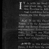
, set to screen, contrast increased, parts over subject erased =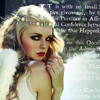
texture by azuremonkey

+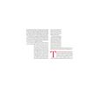
, set to linear burn, parts over subject erased, repositioned =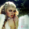
texture by nineteen07
Specialty Textures: Borders/Frames
These keep people from walking into or out of your icons. Just kidding; hopefully you know what these are. Usage of these also varies from texture to texture. Some can simply be set to screen/lighten/dodge (a light border with a dark middle) or multiply/darken/burn (a dark border with a light middle). Others may require deletion/masking of an area of the texture to let the base show beneath, or placing the base on a layer above the frame and cropping, resizing, or erasing parts of it in order to show the frame beneath it (for example, this is how many "Polaroid" photo and mirror/frame textures must be used.

, nudged to the left +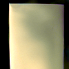
, set to multiply =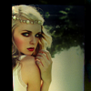
texture by spooky_window

+
, set to screen =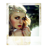
texture by nineteen07
General Textures
General textures often tend to be slightly grungy, but I separate them out from the really grungy textures that I use only if I'm going for a very grungy look. They may also contain a light texture aspect.
General Textures: Grayscale
These are great for adding contrast, changing the lighting to focus on a different part of the image, or egads! just for adding texture. There are many different ways to use these - try soft light or overlay for more subtle effects, and experiment with hard light, pin light, multiply/darken/burn, screen/lighten/dodge, or even just on normal mode with some parts erased for bolder effects. However you use them, remember that you can always try erasing parts of the texture, blurring it, inverting it, lowering its opacity, or adjusting its lightness or contrast.

+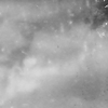
, inverted, gaussian blurred, lowered opacity, set to lighten =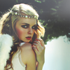
This achieves a smokey look.
texture by lookslikerain

+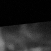
, vertically flipped, increased lightness and contrast, set to soft light =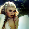
This changes the lighting of the icon to put the focus on her eyes, not the lighter lower half.
texture by yunhe
General Textures: Colored
These textures can totally change the entire feel of an icon and are very versatile. Try out these layer modes for different effects: soft light, hard light, pin light, overlay, multiply, screen, exclusion, burn or dodge. And like always, try inverting the texture, adjusting its hue, saturation, or contrast, using blur on all or some parts of it, erasing parts or lowering its opacity.

, duplicated, moved to top, and set to soft light +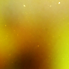
, set to screen, lowered opacity, adjusted hue =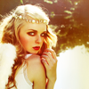
Voila! This gives instant coloration without fiddling with a coloring tool for half an hour.
texture by banquier

, duplicated, moved to top, set to soft light +
, set to exclusion =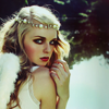
This gives a more subtle color change.
texture by rchp_csi

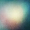
+
, set to soft light +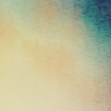
, set to multiply =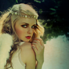
The first layer changes the lighting, while the second layer adds color and darkness.
first texture by spooky_window, second texture by lookslikerain

, duplicated and set to screen +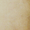
, set to multiply =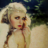
This adds texture and slightly changes the color.
texture by lookslikerain
Stock Images
Stock images are closely related to textures, but they usually contain a recognizable image that can be used as a base or background, as decoration, or like a texture layer.
General Texture Usage Tips
Remember you can, of course, always put more layers over the texture layer, to increase contrast (duplicate the base, bring it to the top, and set it to soft light is an easy way to bring back contrast) or add/change coloring, etc. Furthermore, you can always add a layer to desaturate or change the hue of a part of the image that has become oversaturated or oddly colored because of a texture - you can just make a new transparent layer, use a brush to paint over the bad part (use black or white to desaturate, a color to change the hue), set the layer to color, hue, or saturation, and play around with the opacity.
It is generally best, though, to avoid an over-textured look caused by putting too many very apparent textures on one image. Adding grunge, light blobs, text/decoration, and a border is just too much for one poor little 100 by 100 pixel square. Show some restraint, stick to one style at a time, and textures can really greatly improve your icons!
Just a few more links to other very good guides for using textures, with more creative examples:
http://community.livejournal.com/icon_tutorial/9564934.html
http://community.livejournal.com/ownthesunshine/45176.html
http://community.livejournal.com/virtuosities/19448.html
A Special Bonus
I put together a "Resource Starter Pack" that has examples of all the above mentioned types of textures, each in their own folder, labeled with the name of the texture-maker. None of the textures included were made by me, each was made by the person named in the file name of the texture. Credit this person. There are also some pictures to practice texture usage on. Have fun and go at it! It is available as a .rar file at Megaupload here or at Box.net here.
First off, if you don't know your superduper basics, this is not going to do much for you. Make sure you know the tools of your program first. Check out the below links for tool guides.
Photoshop: http://ealias.livejournal.com/60071.html
Paint Shop Pro translation: http://community.livejournal.com/icon_tutorial/353615.html
Now, a few notes on coloring.
Most people find one tool they like for coloring and stick with it for the most of their basic coloring needs. For me, it's curves, but others use levels, selective coloring, or even fill layers as their main tool. The trick to improving here is to become extremely comfortable and efficient in using your tool of choice, and then learn to not abuse it. So practice, practice, practice on many different kinds of pictures. What I really suggest is play around a lot without being too fixated on achieving a final product; set aside an hour or so to mess around with your program without feeling obligated to produce any icons by the end, and just concentrate on noticing how each change you make affects the image, whether it looks good or not.
Guide to curves:
http://community.livejournal.com/icon_tutorial/10049943.html
Guide to selective color:
http://community.livejournal.com/pixelfun/12276.html
Guide to levels (also talks about curves):
http://community.livejournal.com/icon_tutorial/5678575.html
Guides to layers/layer modes:
exclusion layers -
http://community.livejournal.com/icon_tutorial/8450713.html
various blend modes -
http://community.livejournal.com/icon_tutorial/3549508.html
http://community.livejournal.com/icon_tutorial/3029342.html
explanation of layer modes (pics not working) -
http://maura-icons.livejournal.com/5874.html
Some tips on coloring
As I'm sure is abundantly obvious (especially to anyone who's ever visited ugly_icons), what constitutes good coloring is extremely subjective. However, most people agree that extremes of any kind should be avoided. Really overly saturated images, especially those containing people, should be avoided, as well as extremely washed out icons (however, brightly saturated icons and moderately muted icons can make for a nice style). Drastically altering the natural coloring of human skin is also something that can be off putting. In the case of using a colored texture over the whole image, it may work, but in general, people tend to look ill if their skin veers too far away from pink and peach hues and too close to blue or green hues.
Many people use multiple coloring steps through making one icon, especially if they use textures. My process usually involves an initial contrast/saturation/hue clean up of the picture right before or after cropping and resizing, at least one revisit to coloring throughout the process (of adding textures, etc.), and I often end with a final minor color adjustment. This is why it's important to become efficient at using your tool, and to not fall into bad habits.
And now onto the meat of the tutorial: textures!
I generally break down my textures into two main groups: general textures and specialty textures. The general textures are usually used for "general" texture purposes, and are probably able to be used in many versatile ways, whereas the specialty textures are used to achieve a specific look or effect. There are many subcategories of specialty textures, and each one is usually used in one of only a few ways.
First, we'll talk about specialty textures.
Specialty Textures: Grunge/Scratch
These add a dirty, aged, grungy, or scratched quality to your icon. There are two main ways to use these. If you want the grunge to show up as light spots on the image (this usually makes for a cleaner look) make sure that the background is dark and the scratches/dirt/etc. is light. This may mean you have to invert the texture. Then, place it on a layer above your base and set the layer to screen (or try lighten or dodge, for slightly different effects). Usually this layer is kept on a high opacity, but you can play around with contrast of the layer if you want to strengthen or dull the effect.
If you want the grunge to show up as darker than the image - this can really make the icon look genuinely dirty - make sure that the background is light and the grunge is dark (again, invert if necessary). Place the layer above the image and set it to multiply (or experiment with darken or burn). A lowered opacity might be appropriate, and again you can play with contrast of the texture layer.
Examples - please note that all the examples in this tutorial are not necessarily meant to be finished icons, I only wanted to show the effect of the texture in isolation:
+
, set to screen, flipped horizontally, parts over the subject erased =
texture by azuremonkey
+
, set to multiply, parts over the subject erased =
texture by icecrusher_i_b
Specialty Textures: Light Blobs, Swirls, etc.
These add a lighter highlight to an area or areas of the image where the texture is light. Use these by placing them on a layer above your base and setting them to screen or lighten. Good ways to alter these include changing the hue or saturation of the texture, applying a gaussian blur, lowering their opacity, or increasing their contrast. While these are good for drawing attention to an area, but make sure that you don't end up obscuring your focus by making it too light.
+
, flipped horizontally, desaturated, and set to screen =
texture by waiting_minds
+
, set to linear dodge, gaussian blur =
texture by icecrusher_i_b
Specialty Textures: Bold Patterns
These can be used as a background for your subject, or to cover parts of an image. To use as a background, you can place it behind your base and mask/erase the parts of the base that you don't want. In this case, leave the texture layer settings on normal, unless you have other layers below it. You can try different layer settings, like multiply or darken, on the upper layer that contains your subject. Alternatively, you can place the texture above the base and mask/erase parts of the texture to show the subject. Leave the texture layer on normal layer settings or play around (maybe multiply, hard light, pin light) for different effects.
+
, resized and desaturated =
texture by metaspeshul
+
, resized, desaturated, set to multiply, background erased =
texture by cowsparkle
Specialty Textures: Decorations
These do exactly what the name says. How they are used really depends on the texture. Ones that have a dark background with a light decoration can be used like light textures, set to screen or lighten. Ones that have a light background with a dark decoration can be set to multiply. (For both of these, remember that you can always try inverting the texture so that you can use the other method.) Many decorations can also have their backgrounds removed, so that they can be used on a normal layer setting - you can try carefully erasing with the eraser tool or using a mask layer, or use the selection tool to delete or mask the the background.
+
, moved over, white part deleted =
texture by daintybird
+
, inverted, set to screen, unwanted parts deleted, repositioned =
texture by metaspeshul
Specialty Textures: Text
Text textures can be used if you don't want to write your own text. They may also include a decoration, grunge, or light blob element. Personally, I'm a huge fan of text textures because I usually use them to add a je ne sais quoi to an otherwise plain icon rather than having relevant, legible text. These are used pretty similarly to grunge/scratch textures or decorations in most cases. Remember you can always erase parts of the texture that are covering things that shouldn't be covered and you can always invert the texture. You may also try increasing the contrast and decreasing the brightness if you want a grungy text layer to be less grungy.
+
, set to screen, contrast increased, parts over subject erased =
texture by azuremonkey
+
, set to linear burn, parts over subject erased, repositioned =
texture by nineteen07
Specialty Textures: Borders/Frames
These keep people from walking into or out of your icons. Just kidding; hopefully you know what these are. Usage of these also varies from texture to texture. Some can simply be set to screen/lighten/dodge (a light border with a dark middle) or multiply/darken/burn (a dark border with a light middle). Others may require deletion/masking of an area of the texture to let the base show beneath, or placing the base on a layer above the frame and cropping, resizing, or erasing parts of it in order to show the frame beneath it (for example, this is how many "Polaroid" photo and mirror/frame textures must be used.
, nudged to the left +
, set to multiply =
texture by spooky_window
+
, set to screen =
texture by nineteen07
General Textures
General textures often tend to be slightly grungy, but I separate them out from the really grungy textures that I use only if I'm going for a very grungy look. They may also contain a light texture aspect.
General Textures: Grayscale
These are great for adding contrast, changing the lighting to focus on a different part of the image, or egads! just for adding texture. There are many different ways to use these - try soft light or overlay for more subtle effects, and experiment with hard light, pin light, multiply/darken/burn, screen/lighten/dodge, or even just on normal mode with some parts erased for bolder effects. However you use them, remember that you can always try erasing parts of the texture, blurring it, inverting it, lowering its opacity, or adjusting its lightness or contrast.
+
, inverted, gaussian blurred, lowered opacity, set to lighten =
This achieves a smokey look.
texture by lookslikerain
+
, vertically flipped, increased lightness and contrast, set to soft light =
This changes the lighting of the icon to put the focus on her eyes, not the lighter lower half.
texture by yunhe
General Textures: Colored
These textures can totally change the entire feel of an icon and are very versatile. Try out these layer modes for different effects: soft light, hard light, pin light, overlay, multiply, screen, exclusion, burn or dodge. And like always, try inverting the texture, adjusting its hue, saturation, or contrast, using blur on all or some parts of it, erasing parts or lowering its opacity.
, duplicated, moved to top, and set to soft light +
, set to screen, lowered opacity, adjusted hue =
Voila! This gives instant coloration without fiddling with a coloring tool for half an hour.
texture by banquier
, duplicated, moved to top, set to soft light +
, set to exclusion =
This gives a more subtle color change.
texture by rchp_csi
+
, set to soft light +
, set to multiply =
The first layer changes the lighting, while the second layer adds color and darkness.
first texture by spooky_window, second texture by lookslikerain
, duplicated and set to screen +
, set to multiply =
This adds texture and slightly changes the color.
texture by lookslikerain
Stock Images
Stock images are closely related to textures, but they usually contain a recognizable image that can be used as a base or background, as decoration, or like a texture layer.
General Texture Usage Tips
Remember you can, of course, always put more layers over the texture layer, to increase contrast (duplicate the base, bring it to the top, and set it to soft light is an easy way to bring back contrast) or add/change coloring, etc. Furthermore, you can always add a layer to desaturate or change the hue of a part of the image that has become oversaturated or oddly colored because of a texture - you can just make a new transparent layer, use a brush to paint over the bad part (use black or white to desaturate, a color to change the hue), set the layer to color, hue, or saturation, and play around with the opacity.
It is generally best, though, to avoid an over-textured look caused by putting too many very apparent textures on one image. Adding grunge, light blobs, text/decoration, and a border is just too much for one poor little 100 by 100 pixel square. Show some restraint, stick to one style at a time, and textures can really greatly improve your icons!
Just a few more links to other very good guides for using textures, with more creative examples:
http://community.livejournal.com/icon_tutorial/9564934.html
http://community.livejournal.com/ownthesunshine/45176.html
http://community.livejournal.com/virtuosities/19448.html
A Special Bonus
I put together a "Resource Starter Pack" that has examples of all the above mentioned types of textures, each in their own folder, labeled with the name of the texture-maker. None of the textures included were made by me, each was made by the person named in the file name of the texture. Credit this person. There are also some pictures to practice texture usage on. Have fun and go at it! It is available as a .rar file at Megaupload here or at Box.net here.