MAGICMAKERS INTERVIEW (PART III)
this is the third and last part of our interview!
part one.
part two.
THE PARTICIPANTS



darlingbones ohgollygeedamn hopeitallaway fouroux delorentoes



bussbuss realproof justmyb0nes eamesie spud66cat



mm3butterfly shrimpy_19 raiindust blue_emotion rahelcs
please consider that not all of us are native english speakers!
WHAT IS YOUR EARLIEST SAVED ICON?
(IF YOU CAN FIND THE SCREENCAP OF SAID ICON, MAKE A NEW ICON TO SHOW THE DIFFERENCE IN YOUR CURRENT TECHNIQUE)

LOL PREPARE YOURSELF! I found these when I was cleaning out an old username:


Oh my goodness it is ghastly! Poor Aragon! Not the very, very earliest I ever made but the first icon from my first posted batch.

i don't have any earlier icons to share, because i deleted them. oops.

I'll have to pick the joker icon once again. I don't have anything pre-2008 :c it's not the exact cap, but it's from the same scene:
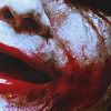
>>


This was for an icontest and I have a whole bunch of icons I didn’t even post in my icon retrospective because I forgot I had a comm before I started posting at doctor_boosh. This thing is hideous, no lie but somehow it got Mod’s Choice and that was the first ever award I won in iconmaking. I don’t have the exact cap I used for this but I made an icon from a cap from the same scene to show the difference in my style.

I know which one I prefer LOL.

OMG NOOOOO. Okay, but it is really bad.

here have another:


Ok, the earliest in my icons-folder on PB is this, I think:
I doubt there'd be much of a difference, what do you think? XDXDXDXD Sadly I don't remember what ep that was...

The first one was made in 2008 (when I begun to do icons) and the "new" version in may this year.

->


made September 2005

This is embarrassing, but here it is:

It doesn't look like I colored it at all, just cropped it and added text. I didn't know how to do ANYTHING in whatever photo editing program I had back then. It was all I could do to figure out how to crop and add text. I cant believe I actually thought this was even presentable.
I recently played around with the image again and this is what I came up with:



Hello exclusion layer, boring crop and lack of contrast. Not too bad (there were worse ones in the batch, but I'm embarassed to show them here :P), though Buffy and her pals suffered a lot on my hands. I couldn't find the same screencap (I like that one better, why can't I find it??), but here's one from the same scene (I think? Is it weird that I can tell Buffy seasons apart by looking at Buffy's hair?), and here a revamped icon.

I'm sure I wanted to focus on Buffy's smile and hair the first time around. But the resolution was low, so I dared not to crop closer, and went with negative space instead.

>>

Unfortunately (or not), I lost all my icons before my current community was created due to my laptop having a little breakdown so I only have as early as my first falloutoftrees batch. I definitely like the new one better than the old one :’)


(2007) >>

(2011)

Ooh the shame haha. I can’t remember exactly what my first icon was, but this one was from the very early days:
and a remade version:

it's definitely not the earliest. but it's the earliest i have saved.

>>

IF SOMEONE WANTED TO START OFF MAKING ICONS, WHAT ADVICE COULD YOU GIVE THEM?

TUTORIALS. Read them and embraces them! I especially recommend anything by eamsie, killcolor, letsey-x and exp0se. In fact check out icons_concrit it's full of goodies.

Experiment! Read lots of tutorials but pay attention to techniques and what they do rather than the overall product. Don’t be afraid to ask for/receive concrit too.

practice. practice. practice. no one knew all the stuff from the beginning. it takes a lot of time to get to know PS and there is so much to explore.

start with a subject (tv show, movie, whatever) you find really inspiring. don't pick a fandom, because you've seen it's popular in the iconning world (like doctor who, for example) and gets many comments. believe me, if you force yourself to make an icon of something you don't find inspiring, you won't be satisfied with your result. and, of course, practice! look for concrit, even though it can be tough to receive sometimes, but if you're open towards it, it'll help you a lot.
don't expect to become better within weeks. as stated in the first couple of questions, people here have been making icons for 5+ years (: it needs time, don't give up!

I’d say enter icontests, that’s how I got started and just let it develop from there. Icontests often take care of all the hard work for you, like finding your caps or pictures or just setting a theme. Also, read a few tutorials to give you an idea of some of the iconmaking processes other makers go through. Do not download .psds because that’s lazy if you are starting out. I download .psds just to see how makers made a certain icon then I just leave it.

Experiment! Don't let 'no comments' get you down! Read a lot of tutorials. Participate in a lot of LIMS and Rumbles, it's a good way to cut your teeth.

Try everything. Sure, things will look like crap, but really.. just try them, and see what works for you. Don't use PSDs and just copy your things in there, you'll learn nothing, except maybe the copy and paste tools. (Not that PSDs are generally bad, it’s all about how you use them.) If you look for tutorials, go for those explaining a tool, less those that are made to create a specific icon.

Don't read tutorials at first. I know it sounds weird but I think the best way to learn is to open a picture under the graphic program you're using and playing around yourself with the settings.

Don’t try too much too fast. I know everyone wants to make the complicated icons NOW, but you’ll never be good if you don’t take the time to learn how your program and the basic tools work. Baby steps, and move on from there.

First, find a fandom/subject that you really love and that will help keep you motivated to improve, even if you don't get a lot of comments starting out. Second, just experiment…with different types of adjustment layers, textures, and blend modes, trying different combinations to see what you come up with. I've learned more from trial and error fiddling around than I have from any tutorial.

Pick your favorite show. Open your preferred graphics program. HAVE LOADS OF FUN. Never forget that fun is the point. The rest comes with time. :)

I would tell them to use as many tutorials as you can to learn the tools of the trade. However, tutorials will only do so much which is why experimenting is a must. I spent so long reading tutorials that I never really got to learn what each tool did and about the tools that weren’t explored in tutorials. And I would also tell them to be positive; after all, your icons will never get any worse than they were the day you started!

- Look around and see where you can get advice from on the basics. good_tutorial has amazing tutorials waiting to be used, while icons_concrit is based on providing constructive feedback to icon makers of all shapes and sizes.
- Don't feel as though you have to compromise your stylistic integrity, no matter what sort of constructive feedback you receive. What qualifies as a good or bad icon is subjective, and dependent on the tastes of each person. And we are all individuals, with individual taste. So just because someone doesn't necessarily like an aspect of your icons (be it your colouring, cropping or even composition) it doesn't mean it's bad. Perhaps just different.
- Watch our for the quality of your icons. Remember to save them as PNG (it results in a better quality in general) and that every layer you alter in your graphics program generally lowers the quality of the original image a little less.
- Don't be afraid to make mistakes. You can learn from mistakes, and you can also find brilliance in mistakes. So what if the colouring didn't turn out the way you had planned? The new colour might be even better! Keep in mind that through experimentation and evolution of style comes confidence.

Practice, practice, practice! Don’t give up if you don’t like what you’re producing, just take your time, read tutorials to gain insight, but don’t rely on them, use them more as a starting point and get to know your graphics program. I’d suggest starting simple and mastering the basics before trying too many different techniques-it’s worth it.

look at psds and tutorials and try and understand what the maker does and why, how certain tools work.
PICK 3 TUTORIALS/GUIDES THAT ARE A MUST-READ FOR ICON MAKERS.

Well my previous answer played into this one nicely XD
Texture/Brushes guide: http://distractiions.livejournal.com/24047.html
Using Masks (old but still relevant!): http://users.livejournal.com/_jems_/221506.html
Text Workshop: http://icons-concrit.livejournal.com/6227.html

Unfortunately, while I still read tutorials, these days I am not very consistent with adding to mems/bookmarking them. Pretty much anything posted at good_tutorial will definitely help.

→ extending backgrounds by shoqolad
→ textures/brushes guide by shoqolad
→ font guide by letsey-x
→ font guide by exp0se

I'm not much of a tutorial reader, to be honest. one that really helped me a lot, though, is this one by schmiss.

The best tutorials I’ve read have all been from Makers of the Month over at icon_crack but that doesn’t seem to happen much anymore but the older entries are really handy for iconmakers.
http://icon-crack.livejournal.com/1524715.html#cutid1 (Great for b&w icons)
http://icon-crack.livejournal.com/1327103.html#cutid1
http://icon-crack.livejournal.com/964641.html#cutid1 (all time favourite! Don’t worry about the quality of the images, this was posted pre-photobucket .jpeg fiasco!)

I learned how to use selective color layers from eamesie at her old comm ownthesunshine.
In fact it was this tutorial that changed my icon making skills, cause before, as you can tell from my first icons above I was just setting everything to soft light and running up the saturation... I was also cutting out subjects with a LASSO. GOOD LORD. -->
http://ownthesunshine.livejournal.com/59785.html . I seriously looked at this tutorial maybe 1,000 times.
I know I have read lots and lots of tutorials but after losing my old computer I don't have lists of them anymore. I am sorry.

I don’t often read tutorials, I will glance at things my friends post, and then promptly forget everything they said. XD
But the one’s that did help me, where elli’s cropping tutorials:
http://elli.livejournal.com/281012.html#cutid1 - Calculations & Channels
http://elli.livejournal.com/168085.html - Simple Beginner’s Guide to Adjustment Layers
There was one more for using paths, but someone didn’t tag that right(*glares*).

I don't read tutorials but I love guides and Q&As. I advise everything posted at good_tutorial and this masterpost at icon_talk. For a particular top 3:
- Q&A by eamesie HERE
- Q&A by exp0se HERE
- Q&A by shoqolad HERE

http://evercouldbe.livejournal.com/6361.html by 00mina: excellent tutorial on blending
http://good-tutorial.livejournal.com/7819.html by herdestiny: Master Guide to Curves
http://elli.livejournal.com/353592.html by elli: extracting images and negative space icons

Texture use guide: http://good-tutorial.livejournal.com/4498.html by eamesie
Font guide: http://letsey-x.livejournal.com/15806.html by letsey_x
Tutorial for extending backgrounds: http://good-tutorial.livejournal.com/30000.html by shoqolad

I still swear by this Cropping tutorial (http://driftedfar.livejournal.com/12402.html#cutid1)
Layer blend modes, brushes, textures, insightful. (http://good-tutorial.livejournal.com/29481.html#cutid1)
Everything I know about light blobs came from here (http://distractiions.livejournal.com/24047.html)

http://acrobatica.livejournal.com/43636.html#cutid1 by schmiss
http://icon-crack.livejournal.com/1327103.html by neversleeps
http://iconictea.livejournal.com/10354.html#cutid1 by enchantedteacup

A Guide to Blending by appleindecay
Colour Normalization by lwena11
A Guide to Text by absolutelybatty

http://letsey-x.livejournal.com/30131.html - letsey_x has made a few guides I’ve found useful over the years, particularly this one
http://bel-perdente.livejournal.com/14198.html - this one is a useful guide to lots of different fonts
http://ivetica.livejournal.com/4379.html - this one is my favourite recent one :) Really helpful regarding light blobs.

i haven't read tutorials in ages, and i have no idea what were the ones i read when i started making icons. sorry.
WHICH ARE YOUR TOP 3 (CHALLENGE) COMMUNITIES IN WHICH YOU FIND INSPIRATION?

icon_crack - there is always AMAZING variety here
20inspirations - this place is genius, I think it helps a lot of people
makeitlarger - wallpapers don't get enough love, there is some amazing work there and more people need to get into it!

Erm, I haven’t been participating in things as much as I like and I am probably not supposed to list magicmachine! I have just started out at 20inspirations and I am finding it really challenging but definitely VERY inspiring. I am also enjoying the challenges at elitetardis.

→ elite_specfic
→ 20inspirations
→ thesatanpit (even though i am not a member of the last, but it just always so good looking and has great challenges.)

20inspirations - not much of a surprise, I guess. I think this community and its challenges shape a lot that is happening in the icon world here at LJ.
magicmachine - I love the activities we have here and I'm pretty much a fan of everyone single maker. every time anyone posts, I'm super excited to see what they came up with this time :3
iconstant - well, when it used to be active anyway. this was a fantastic community for LOST icons. I wish someone would bring it back to life :c

20inspirations has been fantastic in sparking my creativity again, and the camaraderie of everyone there, especially with the creation of 20insp_talk makes iconmaking more fun and enjoyable.
iconpraise is always fantastic because you get to see the best icons and it’s always something to aim towards.
magicmachine of course! Or rather the magicmakers challenges. Especially now with the new rules about participation, it’s a great way to force you to make icons.

20inspirations & magicmachine are really the only 'challenge' communities that I participate in.

20inspirations
I am sure my answer will be totally unique, but really, it is just the right amount of interesting and challenging and gives you room to focus on anything you want (unlike other 20in20s which are more rigid).
trope_overdosed
Sure, I’ve only taken part once now, but I’ve spied a lot and it always looks like SUCH FUN.
No third for challenges, sorry.

I don't find inspiration in communities. It comes from cinematography, caps and music. Though, 20inspirations have gorgeous inspiration posts.

Actually I only very rarely participate in challenges and I never go to them for inspiration. I don’t have three where I actively participate. Like I said, I make icons in batches when the mood strikes, I’m just not able to make icons just because there’s a challenge deadline. My main inspiration is fandom, and looking at other icon makers’ work (mainly by stalking justmyb0nes’ userpics).

Tough question seeing as I'm in loads of challenge communities. First off, I'd just like to say that although it is officially closed, starttheclock will probably always be my favorite challenge comm. I had such a blast when I finally got in there and was able to participate. We had the MOST EPIC pass it on challenge that I have ever seen. And I still find looking through old entries there very inspiring. The BSG fandom had some amazing makers. And although its not as active as it used to be, I'll always have a soft spot for icon_crack. That's another one where I love just scrolling through entries and being blown away by the awesomeness. More recently, I've discovered elite_specfic, which is perfect for a scifi/fantasy fan such as myself.

20inspirations, c'mon, the inspiration is even in the NAME. trope_overdosed, because I could spend aeons at TVTropes, and turning it into an icontest was a great idea. I only participate on those two, I think? Recs?

elite_fringe, elite_specfic and 20inspirations are my favourite ~challenge communities that also provide me with inspiration. I practically used to make all of my Fringe icons by just entering at elite_fringe because I found the community so fun. elite_specfic is great because the themes are always so interesting and there is a broad but defined range of shows to icon which challenges me. The inspiration that 20inspirations provides is obvious because the inspiration posts are always easy to rely on for great material and prompts.

trope_overdosed: Perhaps this is a little bit of self-promotion, but I sincerely wish I could feel comfortable enough to participate in the challenges my co-mods and I design (or borrow even) for this comm. Perhaps that's a little biased (and slightly narcissistic) but honestly, there's a great mixture of challeges that work to create inspiration in makers of all shapes and sizes. What more can a challenge comm as for?
big20in20: Each round the sign-up themes are different, and the themes themselves are wonderfully creative, with a brilliant mixture between interpretative and technical. Basically lots of fun, and probably a great place for new and experienced icon makers alike!
inspired20in20: Only one Round has been posted thus far, but I already have high hopes for this community. Anyone can participate, and the Round 1 themes post was absolutely inspiring, even to someone who didn't get to sign-up. Definitely on my to-watch list, and on my to-participate when I have time list.

I don’t tend to participate in many challenge communities, but I find these two good:
20inspirations
who_rumble
The first really pushes me to work outside my comfort zone at times, and the second has some fun challenges and ensures I produce something each week whilst it’s running.

magicmachine, obviously, elite_specfic, elitesimplicity.
WHO ARE YOUR CURRENT TOP 3 ICON MAKERS (MAGICMAKERS EXCLUDED) AND WHY?

Well my favourite maker just got taken on at magicmakers so this is an issue! Um let me see!
motorized is my IDOL. Her use of texture makes me droll and her colouring is constantly unique and relevant to the image.
calikalie's colouring is really unique and so stunning. She's a genuis with composition and her lack of contrast makes my heart go boom, not many people can pull it off.
shoqolad her icons can often have this flat, painted quality to them that I just have no idea how she does, it's so fresh and stunning. Her icons are a great example of effective sharpness!

Oh gosh this is so difficult! I am in love with so many makers at the moment. Everywhere I turn there are more posts that leave me utterly stunned. I am going to go with literally the first three that came to the top of my head!
quiddity_ at iconsicle - Her cropping and composition are fantastic and teamed with gorgeous, vivid colouring makes for the most brilliant batches. Also a huge inspiration for her b&w icons which are perfectly contrasted with just fantastic lighting. Go have a look at her batch of ‘The Fall’ icons if you haven’t already gushed over them! Absolutely amazing use of vibrant colours and text.

kawaii_chicken at absolucion - Be careful if you haven’t checked out her stuff before because I swear you will be stuck in one post for hours just pausing to stare at each icon individually. There is so much detail and creativity plus the must delicious looking use of colours. Her icons are really something else; there is just so much detail and finesse!


firstillusion at illusoir_icons - There is a really nice clarity in the colouring of her icons that makes the icons look rich and clear cut. Going back and looking over posts as I wrote this there is something distinctly refreshing about them: crisp contrast and perfect lighting. Really stunning icons!

→ ieatstickers at detailsoflove
i've never seen one icon that i didn't liked, even if it's not of my interests or fandoms. i'm just amazed by the talent. seriously the coloring and texture skills are beyond amazing. and make me go aww every time. so sad she/he didn't post that often anymore. happens a lot to my favorite icon makers to be honest. boom.
→ dekolette at stolenlights
every single icon she do is pure magic. i love everything about her work. it's so bright and shiny with wonderful texture use. the coloring is eyegasm. you just have to fall in love with her icons once you've seen them. i do hope she'll come back to icon making one day. boom.
→ prettybutt at atomicapples
seriously she rocks it every time. her text is hilarious. and the complex icons are one of the best i've ever seen. i love her coloring skills. outstanding and simply beautiful work. boom.
honorable mentions (just because i can.)
darlingbones at snorkjuice because i can't say any word about my favorite icon makers (current or not) without mentioning darlingbones. nonetheless the question said, magicmakers excluded. she will forever have my love.
justmyb0nes, vetica, motorized, and and and. yeah yeah i stop it.

motorized - I have been her fan for the longest time. she did those crazy strong colours before anyone else, I believe. absolutely outstanding stuff, amazing center crops. I'm thrilled to see her post again now and then (:
vetica - used to be a maker here (come back, bb ♥ ) and is absolutely exceptional nowadays. his icons and compositions stand out to me, and I'd recognize his icons among thousands. they're so refreshing to look at, because they're so light and breezy :D haha, does that even make sense?
juanxyo - crazy compositions and flawless colours. these are the sort of vibrant colours I love to look at. PLEASE POST MORE OFTEN.
also amazing:
born_butterfly, sarisafari, elifc, kawaii_chicken ...

alisea_dream - Her icons always have this smoothness to them but they are also sharpened just enough, if you know what I mean? She makes great use of texture and makes some crazy manips of Allan A. Dale as a DW companion LOL. Also, she’s lovely :-)
vetica - I love their fresh and clean style. When I saw his True Blood icons, I was amazed that he could do something with the caps that I’ve never seen before.
whenitsquiet - I love their warm colouring and their cropping is always amazeballs and she covers such a wide area of fandoms so there is always something for everyone.

calikalie - THE COLORS, OH THE COLORS! Have you seen the COLORS!
heartoutofstone - MORE COLORS, and I love the compositions and she is so good at using shadow and light, *drooools*
marylou_gr - Her icons are just always GOOD. ALL of them. Her icon batches are just so perfectly edited and guh. No one makes better solid clean dark/dramatic icons.

calikalie, burymyregret
calikalie for the most lovely colouring, it’s just so warm (even when there are cold colours) and everything is so well put together.
burymyregret for amazing simplicity, that really isn’t all that simple. Her cropping is outstanding and everything is always so bright and clear.
Instead of a third have some old favourites of mine.
elli, talitha_bee, emily_reich
elli.Yes, she has posted more stuff again, but she so rarely does, so this counts as old. ;) Anyway, the lady has taught me so much and watching her actually work is mindboggling.
talitha_bee. When I want to go for simple icons, I want to do them as she did. Unlike calikalie before, these icons are cool and seem detached, but at the same time so full of life.
emily_reich. Truly someone who has a trademark style, that you don’t get sick off and that is so very her. Yes, people emulate it, but even when they do, I have to think, she would’ve done it better.

calikalie, wildpages & absolutelybatty
And because 3 isn't enough: gigglemonster, colourmayfade, talipuu & born_butterfly.
I admire all of them. They are different in style but they all have an outstanding way to play with colors, lights and composition.

elli, because she makes the most gorgeous negative space icons. When I grow up I want to make icons like that
.
emily_reich, because all of her icons are just so soft and elegant. She’s the only one who can make me really appreciate simple icons.
calikalie, because there’s nothing she doesn’t do, so much variety in her icons and always flawlessly executed.

It's so hard to pick favorites, and I'm not that great at explaining why I like something, but here it goes:
prettypinkdork @ paper_spaceship I love her coloring. Whether she goes for bright or more subdued coloring, it always seems to fit the image. She also has such cool, creative compositions, text, and texture use.


kawaii_chicken @ absolution I don't normally follow makers who work primarily in fandoms I'm unfamiliar with, but I made an exception here. I adore the complex compositions, use of negative space, and bright, vibrant coloring. Her icons are like eye candy.


xtine005 @ polaroid_this Her coloring is so bright and vibrant without being over saturated. And her icons have a softness to them while still looking clear and crisp.


TOP 3? How cruel :P
calikalie, kawaii_chicken and talipuu, for the MINDBLOWING compositions and colorings. My heart's desire is to make gorgeous compositions like those.

darlingheart @ imprintingss because she does flawless blending and the colours that she creates are just so amazing. Mary also has a knack for creative compositions that I can’t seem to get a handle on.
wildpages @ we_use_cheats because she makes the most beautiful Doctor Who icons in the whole galaxy. Ga has a real eye for lighting and manages to infuse such rich colours into her icons that I’ve seen few makers do.
motorized @ imotorized because FLAWLESS ICONS ARE FLAWLESS. The colours, the creativity - everything just blows my mind.

absolutelybatty
I know for a fact that the amazing absolutelybatty has never worked with vibrance. Therefore I will forever be in awe of her talent for making even the darkest shows (Supernatural) have light and vibrancy about them! And her ability to look at an icon and piece together a story? Utter perfection! Not to mention her amazing lighting skills! I could flail about this girl for an eternity, but instead, I shall let examples do the talking.


saxify
Amazing colour use. Flawless colour use. saxify's icons make me sit back and go 'Wow', because she is achieving something I definitely couldn't ever, even if I wanted to. And her composition? Stunning as well. The same goes for texture use. Take a look below and be as amazed as I am that someone can create these wonderful pieces of art! Seriously. THE COLOURS ♥


antonia757
My favourite new icon maker, who is severely under-loved and under-appreciated. She can create this lightness to images that I wouldn't even dare attempt (Sucker Punch and Teen Wolf examples below) and has this amazing sense of colour that I am so in awe of. As an added bonus, her taste in fandoms is slightly unusual, so if you are looking for something that is less-iconed then perhaps antonia757 is your girl!


xtine005. Her icons are just so stunning. I love how they have such soft yet rich colouring. Her Harry Potter icons blow me away.
sallyna_smile. I love how daring the colours are, her texture use is fab, and she uses some really interesting and beautiful composition in her work.
likealight. I love how her icons are both soft yet clear, and the colouring and lighting is stunning.

yoli_19 - i love her vivid colors and use of negative space.
talipuu - beautiful colors and basically talented in all aspects of iconmaking.
alisea_dream - her colors are still unique and just beautiful.
WHAT KEEPS YOU MOTIVATED?

PRETTY TV SHOWS. There are very few shows I am loyal to iconning. I have consistently icons about 2 tv shows (True Blood & Doctor Who) and TBH the last seasons of these have me winding down. But there is always something pretty to discover, like The Good Wife or Luther! Every time I get into a new fandom I am like MUST ICON. Land communities are also great motivators.

Nowadays definitely talking to other makers. It is so fantastic having other people to discuss the icon making process with and share triumphs and failures with. Seeing beautiful batches from fellow makers is also really inspiring. I also really appreciate every comment I get on my icon posts. All the feedback is so helpful; you guys are wonderful. ♥

i ask this myself from time to time. sometimes i really loose it for a moment, because most of the time i feel insecure about icon-making in general. i keep thinking about what people will think of them. will they be good enough. this keeps me away from being creative, going crazy and try new things. because i put myself under too much pressure. sometimes it's just the lack of inspiration. so whenever this happens i take a break from icon-making until i feel the need to work on it again. so this works, most of the time.
what really keeps me going though, is how much i still have to learn, i love to practice. and i do love to get better of course. and besides that, it can be a lot of fun when it is working. (when photoshop has one of it's good days.)
lastly, when i feel down on motivation/inspiration i look at other peoples, pretty work. be it icons, picspams, posters, and what not. that motivates me a lot.

I think it's the community and the creative outlet icon-making offers.
I had a huge art block for a good 2 years (maybe even 3). I thought I had lost my muse forever and I was incredibly disappointed about that. I tried, every month, to make some icons again, but even the ones I did create I didn't like. I still don't know why that was or what blocked me in the first place.
then the icon community took this really positive turn, and I had one more reason to try and return to regular icon-making. I wanted to be an active part again so badly and take part in all the discussions and activities. somehow, it clicked and I was back (: I don't want to miss icon-making ever again, so I try to keep feeling inspired, and that's amazingly easy with the icon community as it is these days ♥ I only have to think back of the trouble I had with the complexity theme at 20inspirations. everyone was so supportive and helpful and I ended up with this batch I still really love and am so proud of. I hope I'll stick around much longer (:

My flist, sometimes when I moan about not being able to make stuff, they send comments of encouragement to keep me going. I also keep an eye on the last time I made a post to my icon community and think ‘Right, I really need to get a move on and make some icons goshdarnit!’

Positive feedback and the general urge to make something in photoshop I suppose. But I think that commenting is really important.

Everybody else. Shiny things? I hit a major slump some years ago, and really only got back into making tons of icons through LotS-Fandom. The show was just so pretty, and making icons for it felt good, and then I got to know people in the fandom and people liked my icons (Other people liking your things, makes you want to make more... if you feel unappreciated you are less likely to make more things. It’s the truth, it doesn’t need to be denied.) and there was much flailing involved... and so I stuck with it and found my muse again. It was a great thing. Find friends that will flail with you and it will make you actually do stuff, if you feel there is a void you can fill. And really, I do like to make my friends happy, and if I can by making art, that is all the better.
But really, it’s ok to take a breather, your PS will always be there... unless you uninstall it, then you’re lost. (;P) This is supposed to be fun, and get your creative juices flowing. If you’re not inspired, try new things. Whether it be in this medium of cg fanart or something else entirely (I took more pictures).
MAKE ART! It is important, to you and to the world around you. It may not seem that way, but all these things do send a message, be it of a fannish nature, or a political one (if you branch out).
Oh, and fuck the haters... what do they know.
Be creative in your life, always. It’ll make you happy. :)

I don't know. I love making graphics. I've always been creative and icons are a bit of a therapy too. I just keep doing.

Fandom. If I don’t have a fandom I can squee about, I don’t make icons, it’s as simple as that.

What keeps me motivated and coming back is the desire for self-improvement and to make something gorgeous and creative that I can look at and be proud of. Comments and recognition are nice, but that's not what I think about when I'm in photoshop (elements). That's not what's running through my mind when I'm away from my computer but thinking about how much I want to open photoshop and make some icons. Icon making really has become a creative outlet for me.

I'LL BE HONEST. I LOVE THE COMMENTS. I'm shallow, haha. Not only them, though. I love the sense of accomplishment after making an icon I like, and to have the excuse to keep squeeing and basking in the love for some show/movie even after it's over, making something tangible (even if it's not...) out of your appreciation for it.

Music is a big motivational tool for me - I seem to always be listening of singing or playing music wherever I go and I also find it quite inspirational. My lj friends are also really inspirational and they keep me motivated. And of course, all the amazing and pretty tv shows!

I generally just love iconing for the sake of iconing, and that's enough to motivate me. I also think the iconing community (and other icon makers I interact with) are also a huge part of the motivation. I love seeing how they challenge themselves, and then in turn challenging myself to go further and be better. And I think that's a huge part of the motivation as well - that I want to improve for my own sake.

I love my fandoms, so it’s not hard to make icons of them most of the while, but when I’m feeling less inspired I often take a short break and soon enough I’ll be itching to icon again :)

this community. you talented people and the fun i have with the maker activities.
END PART III.
(spotted any mistakes, wrong coding etc? please let me know!)
we hope you enjoyed reading our interview!
it was in the making for a long time. thanks to all of you who participated and to those taking the time to read and comment on this ♥